
Fielo allows you to modify your default Lightning Components for Experience Cloud Sites, so that they comply with your needs. It could be as simple as to change the standard components properties, or even if you need to actually modify or build a new component based on ours. Find out more information on how this is possible below.
Salesforce Experience CloudPreviously known as Community Cloud, as of Salesforce Spring '21 release, Community is now referred to as Experience Cloud and/or Site.
Build and Modify a Component
Since most companies have their own brand identity, there usually is a specific design requirement that must be met when you build the Program's site. Imagine, for example, that you need to follow a color pattern, a format or that you want to add other filters and buttons to the components, in order to follow the brand’s UX.
That's why being able to modify the default Fielo components, or even build one from scratch, might be important for you. For that, we offer an Open Source repository with the code related to all customizable Lightning Web Components - and their sub-components - that Fielo has. We also provide Global APIs that you will need in order to be able to use the open source code however you want to, and to deploy it.
Access the GitHub repository here to download the code. Make sure to read its README file.
Moreover, we want to make it possible for you to help us broaden our repository! If you develop something that would add value to Fielo, such as a new feature or a new component, feel free to place a pull request through GitHub to make it public. Our engineering team will review it and, if they comply with the criteria below, the request will be accepted and added to the repository, so that others can access it too.
Criteria:
- Follow the best practices.
- Be a Lightning Web Component (Aura components will be declined).
Customizing Standard Properties with JSON
In the standard component properties, you have the option of using JSON strings for greater flexibility in your configurations. That is, instead of entering text or a field API name, you can enter a JSON string that specifies custom text, special formatting and more. Let's take a look at a few examples.
Title
The Title property of all components can accommodate a Custom Label. Any changes you make to the Custom Label will automatically be applied to your components, as well.
It's easy to use! In the Title property, enter a JSON string in the format of {"type": "label", "value": "Namespace.LabelName"}.
As an example, let's imagine we have a Salesforce ORG that uses localization to offer a Spanish-language version of the Member portal. They have a custom label called BigChallenges in the namespace ABCInc, which displays the text "Big Challenges" in English and "Grandes Desafíos" in Spanish. Here's how we would use this label in a component title:
{"type": "label", "value": "ABCInc.BigChallenges"}This JSON string will display the value of the BigChallenges label in the component title.
Here's how the custom label title will appear on a Challenges component when the Member portal is localized to Spanish:
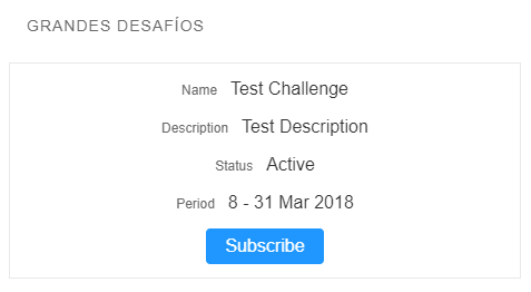
Challenge Subscription with Custom Label Title Localized to Spanish
Custom Labels only appear in Published versionCustom Labels will not appear in Preview mode. You must publish and view the page in a separate browser window to see the label.
Note that the field labels in the Spanish version of the Challenges component are still in English. Next, we'll see how to customize field name labels and more.
Fieldset and Related List Fieldset
You may need to change how field names are displayed in your component, or decide to hide them altogether. You might also prefer to use Custom Labels instead of regular text for your field names. Let's see how!
Field
Each field in a JSON-formatted Fieldset or Related List Fieldset contains the following elements:
"apiName": This is the API name of a field, the same as what you would enter for standard configurations (e.g."FieloPLT__Description__c")."type": This is the data type of the field. Possibilities include"output"(for numbers and text),"link","image","youtube-video","pdf","checkbox","date"and"richtext"."label": This element is where you can specify a plain text field label, or assign a Custom Label. It takes the form of{"type": "text", "value": "labelCustomValue"}, where type can be"text"or"label"and value is either your text label (for"text") or the name of your Custom Label in the form of"Namespace.LabelName"(for"label"). You can stick to the default field name by entering{"type": "default"}."showLabel": You can use this element to hide a field name. Setting it totruewill show the label as configured in the"label"element, while setting it tofalsewill hide the label.
Subcomponent
Subcomponents are special features of components that give them extra functionality, like links to Record Detail views or buttons like Add to Cart in Catalog and Subscribe in Challenge Subscripton. You can include them in a fieldset just as you do a field. Most subcomponents contain the following elements:
"type": Set this to"subcomponent"."subcomponent": This is the name of the subcomponent in the form of"Namespace:SubcomponentName"."label": This element is where you can specify a plain text label, or assign a Custom Label. It takes the form of{"type": "text", "value": "labelCustomValue"}, where type can be"text"or"label"and value is either your text label (for"text") or the name of your Custom Label in the form of"Namespace.LabelName"(for"label"). You can stick to the default field name by entering{"type": "default"}. For buttons, this is the text that appears on the button."showLabel": Set this totrueif your subcomponent will use a label, andfalseotherwise.
Fielo subcomponents include:
- FieloPLT:ShowRecord: This subcomponent links a field to the Record Detail view. To use, add the element
"subcomponent": "FieloPLT:ShowRecord"to the field you wish to link to Record Detail and make sure"type"is set to"subcomponent". - FieloPLT:AddToCart: Used in Catalog, this is the Add to Cart button that allows the user to add a Redemption Item to the Shopping Cart.
- FieloPLT:ChallengeSubscribe: Used in Challenge Subscription, this is the Subscribe button that allows the user to subscribe to a Challenge.
- FieloPLT:DeleteFromCart: Used in Checkout, this is the Delete button that allows the user to remove a Redemption Item from the cart.
- FieloPLT:ProgressBar: This is the Mission Progress Indicator from My Challenges. To use, add the elements
"apiName": "Progress"and"config": {"layout": "layoutName"}, where"layoutName"is"gauge","bar"or"circular".
Now, let's see how this could be applied in the Fieldset of a My Challenges component:
[
	{
		"apiName": "Name",
		"type": "subcomponent",
		"subcomponent": "FieloPLT:ShowRecord",
		"label": {"type": "label", "value": "FieloPLT.Name"},
		"showLabel": true
	},
	{
		"apiName": "FieloPLT__Description__c",
		"type": "output",
		"label": {"type": "text", "value": "This Shouldn't Appear"},
		"showLabel": false
	},
	{
		"apiName": "FieloPLT__Status__c",
		"type": "output",
		"label": {"type": "text", "value": "Current Status"},
		"showLabel": true
	},
	{
		"apiName": "FieloPLT__Period__c",
		"type": "output",
		"label": {"type": "text", "value": "Participation Period"},
		"showLabel": true
	}
]
In this example, the Fieldset consists of four Challenge fields: Name, FieloPLT__Description__c, FieloPLT__Status__c and FieloPLT__Period__c.
Name has the subcomponent FieloPLT:ShowRecord, meaning it will link to the Record Detail. Its field label is set to the Custom Label "FieloPLT.Name" ("label": {"type": "label", "value": "FieloPLT.Name"}). FieloPLT__Description__c's field name is hidden ("showLabel": false) and the field name labels for FieloPLT__Status__c and FieloPLT__Period__c were customized ("label": {"type": "text", "value": "Current Status"} and "label": {"type": "text", "value": "Participation Period"}, respectively).
Here's how this example component would look (in Table layout):
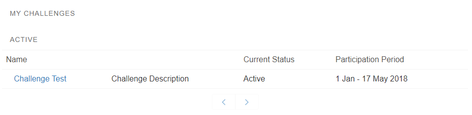
My Challenges Component
Record Detail Fieldset
As with Fieldset and Related List Fieldset, you can enter a JSON string into the Record Detail Fieldset property of a component in order to customize the contents of the record detail view. You can define the name and number of sections, the number of rows in each section and which fields to include in each row, including any custom display names or labels. Let's take a look at how.
Section
Each section contains two elements:
"title": Title takes the form of{"type": "text", "value": "labelCustomValue"}, where type can be"text"or"label"and value is either the plain text title of the section (for"text") or the name of a Custom Label in the form of"Namespace.LabelName"(for"label")."rows": Rows is comprised of the row(s) that will appear in a given section.
Row
Each row in the "rows" element contains one or more fields that will be displayed in that row.
Field
Each field contains the following elements:
"type": This is the data type of the field. Possibilities include"output"(for numbers and text),"link","image","youtube-video","pdf","checkbox","date"and"richtext"."apiName": This is the API name of a field, the same as what you would enter for standard configurations (e.g."FieloPLT__Description__c")."label": This element is where you can specify a plain text field label, or assign a Custom Label. It takes the form of{"type": "text", "value": "labelCustomValue"}, where type can be"text"or"label"and value is either your text label (for"text") or the name of your Custom Label in the form of"Namespace.LabelName"(for"label"). Alternatively, you can stick to the default field name by entering{"type": "default"}."showLabel": You can use this element to hide a field name. Setting it totruewill show the label as configured in the"label"element, while setting it tofalsewill hide the label.
Let's see how this could be applied in the Record Detail Fieldset of a My Challenges component:
[
          {
            "title": {
              "type": "text",
              "value": "Participation Period"
            },
            "rows": [
              [
                {
                  "type": "date",
                  "apiName": "FieloPLT__StartDate__c",
                  "label": {
                    "type": "text", "value": "Start Date"
                  },
                  "showLabel": true
                },
                {
                  "type": "date",
                  "apiName": "FieloPLT__EndDate__c",
                  "label": {
                    "type": "text", "value": "End Date"
                  },
                  "showLabel": true
                }
              ]
            ]
          },
          {
            "title": {
              "type": "text",
              "value": "More Info"
            },
            "rows": [
              [
                {
                  "type": "output",
                  "apiName": "FieloPLT__Status__c",
                  "label": {
                    "type": "default"
                  },
                  "showLabel": true
                }
              ],
              [
                {
                  "type": "checkbox",
                  "apiName": "FieloPLT__IsProcessed__c",
                  "label": {
                    "type": "default"
                  },
                  "showLabel": true
                }
              ]
            ]
          }
]
In this example, the Challenge record detail view consists of two sections, called Participation Period and More Info. Participation Period has one row containing two fields (FieloPLT__StartDate__c and FieloPLT__EndDate__c) and More Info has two rows containing one field each (FieloPLT__Status__c and FieloPLT__IsProcessed__c).
In Participation Period, FieloPLT__StartDate__c and FieloPLT__EndDate__c have had their field name labels customized to Start Date and End Date, respectively. Note that the "type" for each is set to "date" for proper date formatting.
In More Info, FieloPLT__Status__c and FieloPLT__IsProcessed__c will appear in separate rows with their default field names. Note that the "type" for FieloPLT__IsProcessed__c is set to "checkbox" so that it is displayed as a checkbox / .
Here's how the Challenge record detail view in this example would look:
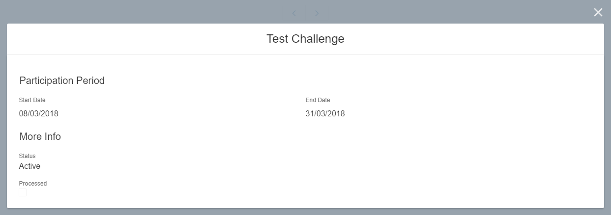
My Challenges - Record Detail View
Advanced Configuration (My Transactions)
The My Transactions component includes an Advanced Configuration property for complete flexibility in how your transaction data is displayed. If you haven't yet, take a look above at how advanced configuration works with fieldsets. Next, we'll see how the JSON tree for My Transactions is structured.
Title
"title" defines the title that will appear at the top of the component. It takes the form of {"value": "My Transactions", "type": "text"}, where "value" is the plain text title for "type": "text" or the API name of a Custom Label for "type": "label".
Date Filter
"dateFilter" specifies the API name of a Transaction field of type Date or Date/Time by which a user could filter Transactions by date. One popular option is to use "CreatedDate", which contains the date the record was created. If you'd rather not include a date filter, you can leave this value blank ("").
List Views
"listviews" contains the List Views to be included in the component. Each List View consists of the following elements:
"title": Enter a title in the form of{"type": "text", "value": "labelCustomValue"}, where type can be"text"or"label"and value is either the plain text title of the list (for"text") or the name of a Custom Label in the form of"Namespace.LabelName"(for"label")."paging": A value oftruewill enable records to be displayed in pages. To disable this, enterfalse."quantity": If using Paging, enter your preferred maximum number of records per page."collapsible": A value oftruewill make the list expandible and retractible. To disable this, enterfalse."layout": Enter"table"to view Transactions in list format or"grid"to view them in tile format."condition": Enter a condition for record filtering in the form of[{\"field\":\"someAPIFieldNameHere\",\"value\":\"someValueHere\",\"operator\": \"equals\"}]"."fieldset": Enter one or more fields as outlined in Fieldset and Related List Fieldset."recordDetail": This contains data for Record Detail views, that is,"sections"(see above),"relatedLists"and"subcomponents"(see below).
Related Lists
"relatedLists" contains the Related Lists to be included in a Record Detail. Each Related List consists of the following elements:
"title": Enter a title in the form of{"type": "text", "value": "labelCustomValue"}, where type can be"text"or"label"and value is either the plain text title of the list (for"text") or the name of a Custom Label in the form of"Namespace.LabelName"(for"label")."objectRelation": Enter the API name of the related object. You can choose from"FieloPLT__Points__r","FieloPLT__BadgesMembers__r","FieloPLT__Redemptions__r"."relationField": Instead of using"objectRelation", you can build a custom related list by entering the API name of a Relationship Custom Field."objectAPIName": Enter the API name for the object of the records in this list.
Subcomponents
"subcomponents" contains the Subcomponents to be included in a Record Detail. Each Subcomponent consists of the following element:
"subcomponent": Enter the name of a subcomponent in the form of"Namespace:SubcomponentName".
Now, let's see an example of how we could implement a complete customization of My Transactions:
{
  "title": {"value": "My Transactions", "type": "text"},
  "dateFilter": "",
  "listviews": [
    {
      "title": {"type": "Picklist", "value": "FieloPLT__Type__c.Adjustment"},
      "paging": true,
      "quantity": 2,
      "collapsible": true,
      "layout": "table",
      "condition": "[{\"field\":\"FieloPLT__Type__c\",\"value\":\"Adjustment\",\"operator\": \"equals\"}]",
      "fieldset": [
        {
          "type": "subcomponent",
          "subcomponent": "FieloPLT:ShowRecord",
          "apiName": "Name",
          "label": {"type": "default"},
          "showLabel": true
        },
        {
          "type": "output",
          "apiName": "FieloPLT__Points__c",
          "label": {"type": "default"},
          "showLabel": true
        }
      ],
      "recordDetail": {
        "sections": [
          {
            "title": {"type": "text", "value": "Information"},
            "rows": [
              [
                {
                  "type": "output",
                  "apiName": "FieloPLT__Points__c",
                  "label": {"type": "default"},
                  "showLabel": true
                }
              ]
            ]
          }
        ],
        "relatedLists": [
          {
            "title": {"type": "text", "value": "Points"},
            "objectRelation": "FieloPLT__Points__r",
            "objectAPIName": "FieloPLT__Point__c",
            "fieldset": [
              {
                "type": "output",
                "apiName": "Name",
                "label": {"type": "default"},
                "showLabel": true
              },
              {
                "type": "output",
                "apiName": "FieloPLT__PointType__r.Name",
                "label": {"type": "default"},
                "showLabel": true
              }
            ]
          }
        ],
        "subcomponents": []
      }
    },
    {
      "title": {"type": "Picklist", "value": "FieloPLT__Type__c.Reversion"},
      "paging": true,
      "quantity": 5,
      "collapsible": true,
      "layout": "table",
      "condition": "[{\"field\":\"FieloPLT__Type__c\",\"value\":\"Reversion\",\"operator\": \"equals\"}]",
      "fieldset": [
        {"type": "output",
         "apiName": "Name",
         "label": {"type": "default"},
         "showLabel": true
        },
        {"type": "output",
         "apiName": "FieloPLT__Points__c",
         "label": {"type": "default"},
         "showLabel": true
        },
        {
          "type": "output",
          "apiName": "FieloPLT__RevertedTransaction__r.Name",
          "label": {"type": "default"},
          "showLabel": true
        },
        {
          "type": "date",
          "apiName": "CreatedDate",
          "label": {"type": "default"},
          "showLabel": true
        }
      ]
    }
  ]
}
In this example, we've created a My Transactions component titled "My Transactions" with two lists: Adjustment and Reversion.
Adjustment will display records whose Type equals Adjustment. It has two fields, Name and FieloPLT__Points__c, and the subcomponent FieloPLT:ShowRecord. That subcomponent allows the user to access a Record Detail view with one section, Information, containing the FieloPLT__Points__c field. The Record Detail also includes a Related List, Points, containing the Name and FieloPLT__PointType__r.Name fields.
Reversion will display records whose Type equals Reversion. It has four fields: Name, FieloPLT__Points__c, FieloPLT__RevertedTransaction__r.Name and CreatedDate.
Here's how this My Transactions component would look:
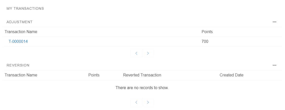
My Transactions Component
And the Record Detail view:
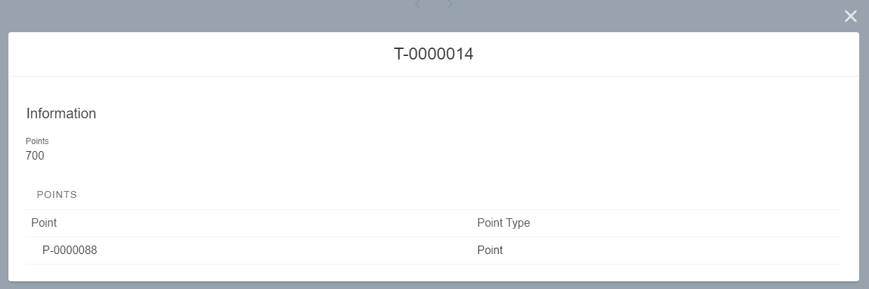
My Transactions - Record Detail View