
Incentives
The Incentives component gives your members a single place to review all of the targeted incentives (Promotions and/or Challenges) which are available for them.
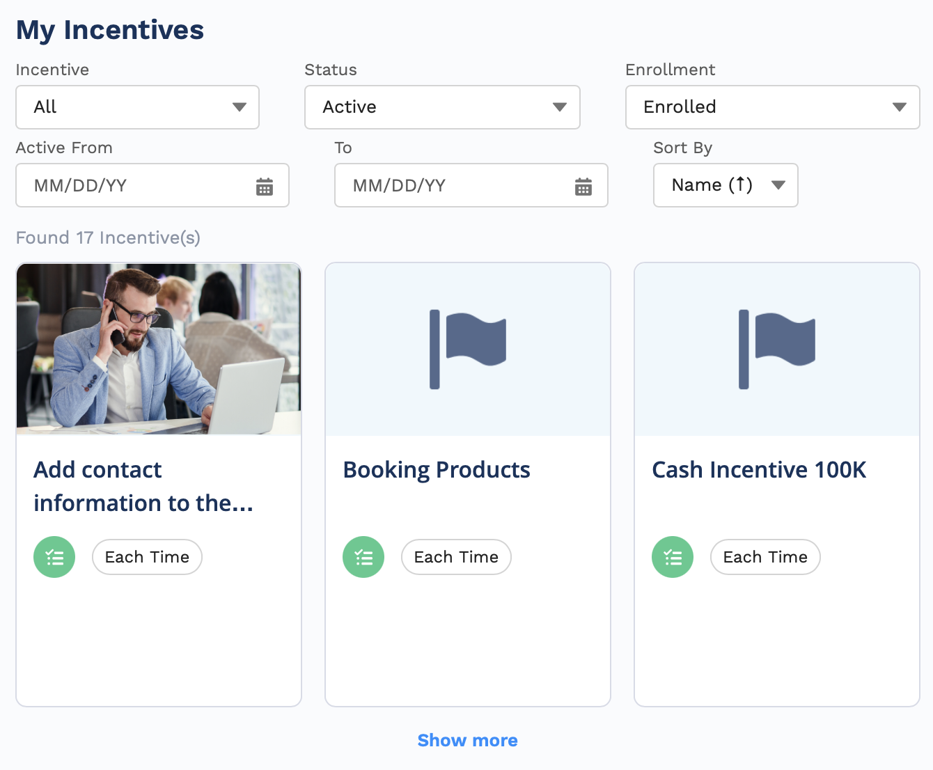
There are two primary parts to the Incentives component.
- The top part lets your members and partners filter and sort the incentives.
- The lower part shows all of the applicable incentives based on the filters and sorting done.
You control exactly what is available for both of these parts.
Make sure to add Fielo MX - Member Selector” component on the pageIn order for any Fielo MX Component to work, you need to add the “Fielo MX - Member Selector” component on that page (or the “Fielo MX - Member Overview” with the Member Selector sub-component set). You can find more information here Member Overview.
Setting up the Incentives Components
You will need to drag and drop Incentives onto the screen where you want them to appear. You can also move it around to situate it on the page in a place that you feel makes the most sense. It is a larger component, so placing it in the main area will give your members more room for reviewing all of their possible incentives.
As you set up the Incentives component, keep in mind that it is also available on mobile devices. This will help you to determine what will work best for your members and partners.
Hide Incentives
You can hide certain incentives from your members while using this component. To do so, when configuring an incentive, navigate to the Member Experience section and enable Hide Incentive in the Front End.
This lets you hide incentives that you don't want members to see, for example, incentives created for internal scoring only.
Setting Up the Component
There are more fields for this component, giving you more control over what displays for your users.
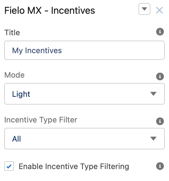
Title
This text field will contain the Title Label. “Incentives” will be its default value. An administrator user can customize the message by defining a Salesforce custom label value to be shown instead.
Mode
This field controls the overall look and feel of the component. We can choose between two settings: Light or Dark.
Incentive Type Filter
This field controls the value that will load by default on the "Incentive Type" filter. You have three options:
- All will display both types of incentives (Promotions and Challenges).
- FieloPLT_Promotion_c selecting this will display only promotion incentives.
- FieloPLT_Challenge_c selecting this will display only challenge incentives.
Enable Incentive Type Filtering
Uncheck this setting if you don't want members to view/change the values on the "Incentive Type Filter".
Incentive Status Filter
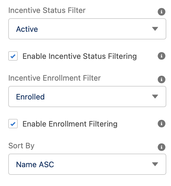
This field controls the value that will load by default on the "Status". You choose the following options:
- All will display all incentives regardless of their status on the same page (Active, Completed, and Scheduled).
- Active selecting this will display only active incentives.
- Completed selecting this will display only completed incentives.
- Scheduled selecting this will display only scheduled incentives.
Enable Incentive Status Filtering
Uncheck this option if you don't want to allow members to change the "Status" filter.
Incentive Enrollment Filter
This field controls the value that will load by default on the "Enrollment" filter. You choose the following options:
- All shows all incentives.
- Enrolled shows only incentives that the member is currently enrolled in.
- Eligible shows only incentives that the member is able to join (eligible).
- Pending Eligibility shows only incentives that the member is waiting to become eligible to enroll in.
- Opted-Out shows only incentives that the member had chosen to opt-out of enrolling in.
Enable Enrollment Filtering
Uncheck this option if you don't want to allow members to change the "Enrollment" filter value.
Sort By
This field controls the value that will load by default on the "Sort by" filter which determines the sorting criteria for the list of incentives being shown. You can choose the following options:
- Name ASC shows the incentives in ascending alphabetical order based on the name of the incentive.
- Name DESC shows the incentives in descending alphabetical order based on the name of the incentive.
- FieloPLT_StartDate_c DESC shows the incentives in chronological order based on the start date of the incentive.
- FieloPLT_EndDate_c ASC shows the incentives in reverse chronological order based on the incentive's end date.
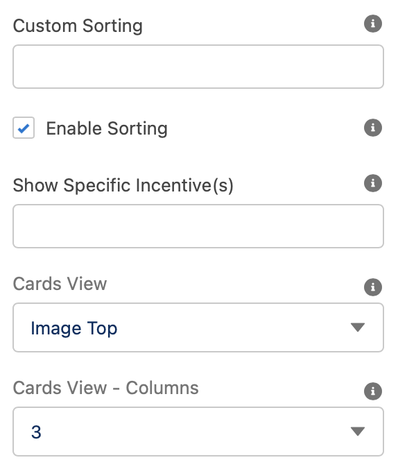
Custom Sorting
This field lets you define custom sort criteria. To do this, you have to place the API names of the fields for which you want to filter, pointing out the type of order desired for each field ASC (for ascending) or DESC (for descending). For example (Name ASC, CreatedDate DESC, CustomField__c ASC).
Enable Sorting
Uncheck this setting if you don't want members to change the component sorting value.
Show Specific Incentive(s)
This field allows you to show specific incentives in the component (instead of showing incentives targeted to the member). It ensures that a specific incentive or incentives are always available for viewing by the members. You will need to add the incentive ID for each incentive you want to include. If you want to add more than one, make sure to separate each incentive by a comma, but no space between them. Depending on the record id object:
- Behavior ID shows only the incentives which contain actions related to such behaviors according to member segmentation.
- Incentives ID shows only the incentives listed.
When empty, the component will show/render the incentives as usual.
Cards View
This setting controls the overall look and feel of the Incentive card view:
- Image Top shows all incentives in card view, setting the incentive image at the front of the card.
- Image Background shows all incentives in card view, setting the incentive image as the background of the card.
- Image Hidden shows all incentives in card view, hiding the image on it.
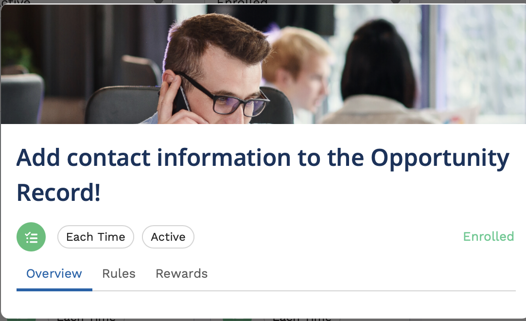
- Disable will not show the incentives card view. Instead will show the incentives in detail view.
Cards View - Columns
This field controls the number of columns to be displayed in the card view. Can be set from 1 and 5 columns. By default, it is set to 5 columns.
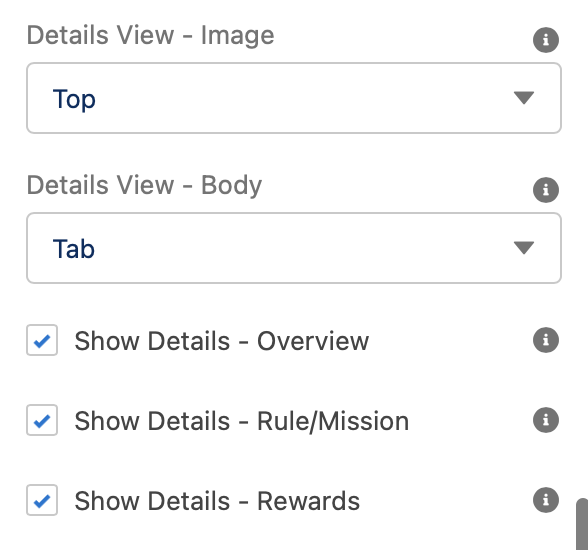
Details View - Image
This field controls where the Incentive Image will be shown on the detail view. You can choose the following options:
- Top
- Left
- Right
- Disabled: if selected no incentive image will be displayed.
Details View - Body
This field controls how the different sections (Overview, Rules/Missions, and Rewards) on the Incentive detail will be shown:
- Tab each section will be shown in different tabs.
- List each section will be shown on the same page one on top of the other.
Show Details - Overview
Shows the description of what the incentive is. By default, it is checked. Removing the check will remove this section from the incentive detail view.
Show Details - Rule/Mission
Shows what the rules or missions of an incentive are. By default, it is checked. Removing the check will remove the rules or mission section from the incentive detail view.
Show Details - Rewards
Shows what the member will get by completing the rules or mission of the incentive. By default, it is checked. Removing the check will reward details section from the incentive detail view.
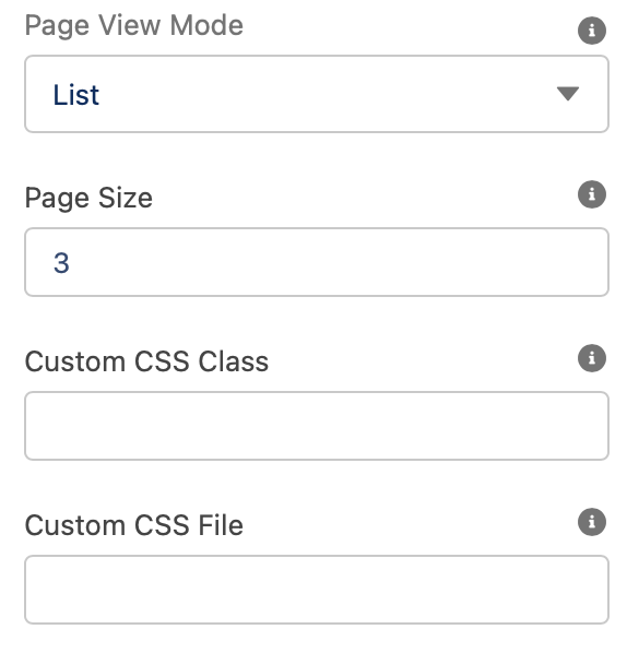
Page View Mode
If there are more incentives to show than the amount specified, you can setup how members will be able to view all of them:
- Pagination page number and the total number of pages will be displayed at the bottom of the component. Allowing members to move back and forward the different pages.
- List provides a Show More option at the bottom of the screen so the member can expand the number of incentives displayed.
Page Size
You can specify how many incentives you want to be displayed on a page or as a part of the initial list.
Custom CSS Classes
This allowed Custom CSS Classes to be applied in the main element, separated by space. Work with your IT department to update this with their customized CSS code.
Custom CSS File
This allowed a CSS file to be imported from a static resource. Work with your IT department to include the customized CSS information.
Text Orientation:
This picklist setting will control the overall look and feel orientation:
- Left to Right this is the default value. When selected, all elements will be rendered from Left (first) to right (second.)
- Right to Left when this setting is selected all elements will be rendered from the right (first) to left (second).
Updated over 1 year ago