
Member Experience
Build an engaging member experience across your programs, both in Experience Cloud and on Lightning pages. Using our ultra-flexible Lightning Web components, you can tailor your member experience to the unique needs of your member community.
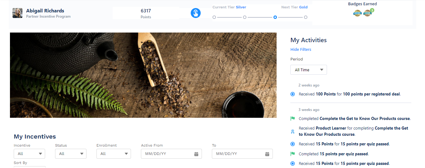
Our suite of LWR-compatible Lightning Web components includes:
- Member Overview
- Activity Feed
- Rewards Notification
- Mission Leaderboards
- Incentives
- Badges
- Profile
- Assistant
- Learning
To easily identify these components, their names are preceded by Fielo MX - on the Lightning component menus in Salesforce.
Our components include a few universal properties:
- Title - you can change or remove the name that appears at the top of most Fielo components. You can enter the name directly or use a custom label (syntax:
$label.LabelName). If you use a custom label, make sure it is NOT marked as Protected. - Mode - you can select whether the component appears in light mode or dark mode to better meet the aesthetics of your page.
- Text Orientation - By default, Fielo components are rendered for left-to-right languages. However, all of them include this property, which allows you to switch to formatting fit for right-to-left languages.
- Custom CSS Classes - if your UI team has created some custom CSS, you can work with them to apply these to Fielo components.
- Custom CSS File - similar to the previous property, you can work with your UI team to apply custom CSS that has been defined in a file. It supports the
.cssextension.
No previewing for custom CSSWhen applying custom CSS to components, changes won't be visible from the Salesforce Digital Experience builder (even in the preview). To see your changes reflected, you need to publish your site and log in as a site user.
Updated over 1 year ago
Did this page help you?