
Member Overview
The Member Overview is a single place for members to quickly see the kinds of information you want them to see in your portal. It's composed of 5 components (which can also be used separately):
- Member Selector
- Member Currency
- Nudging
- Levels
- Earned Badges
When you add this component to the page, you can customize it to choose which components you want to show and in what order.

Member Selector
Member Selector [Fielo MX - Member Selector] connects your Experience Cloud site pages with the Member record of the portal user. It is the keystone of Fielo Lightning Components, as component data is always specific to the program a member is currently interacting with.
Add Member Selector to Pages that use Fielo Lightning ComponentsBecause most Fielo Lightning Components depend on Member data, you need to add the Member Selector component to all pages that use Fielo components (except Registration). But, here's the good news: you can always make Member Selector invisible on a page if it doesn't fit into your design plan.
Member Selector can display member information such as name, program, account, etc.
You can always hide Member Selector if it doesn't make sense for your members on a given page.
Member Currency
This component [Fielo MX - Currencies] shows the different currency types available to the member in the program as well as the quantities accrued (or earned).
Nudging
This component [Fielo MX - Nudging] provides a quick look at all current (active) incentives that are in progress and the rewards the member could potentially earn.
Note: Additional Rewarding, or customized rewarding via a reflection class, will not display here.
Levels
This component [Fielo MX - Levels] shows all the program tiers (or levels), highlighting the member's current tier as well as the next tier alongside the requirements, overall progression, and any benefits associated with them.
Earned Badges
This component [Fielo MX - Earned Badged] shows the most recently earned badges by the Member. You can allow members to view badge detail information such as the incentive awarded such a badge, the date on which it was earned, and the expiration date (if exist).
What You Need to Know About This Component
The Member Selector component is required for every page on which you use Fielo MX components. On pages where you include the Member Overview, you don't need to add the Member Selector element again.
Also, if the only component you are using is the Assistant, you don't need to add the Member Selector again because the Assistant already has it built-in.
Configuring Member Overview
Once you add the Member Overview component to the page, you can tailor it to your needs. You can also remove any of the five subcomponents, though it is probably best to leave the Member Selector.
- Click on the component and the properties panel will appear.
- Update the fields where you would like to make changes.
- Close the popup menu.
- Verify the changes from the member's perspective.
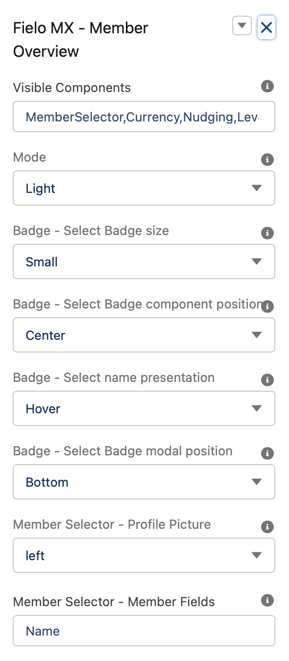
Visible Components
This field allows you to specify which components will be used on the member overview and in which order. To do so we need to list each component name separated by a comma (the order in which you list the components is the order they will show on screen)
Component Names:
- MemberSelector
- Currency
- Levels
- Badges
- Nudging
For example: If we want to show Member Selector, Nudging, Currencies, and Levels components. In this field, we need to set: MemberSelector,Nudging,Currency,Levels.
Mode
This field controls the overall look and feel of the component. We can choose between two settings: Light or Dark.
Badge - Select Badge Size
This field controls the image size of the badges being displayed. You can choose between three sizes:
- Small
- Medium
- Large
If the number of badges to be shown overflows the component container. Only the first X* badges will be shown followed by a +N icon. Clicking on this +N icon will show in a modal all the badges the member has earned.
Note: X and N are different numbers values that can vary depending on the scenario.
Badge - Badge Component Position
This field controls the Badge Component Position, it can be set to Center, Left, or Right.
Badge - Badge Name Presentation
Choose between Hover, On click, and Never to establish how the user will see the badges.
Badge - Select Badge Modal Position
If the number of badges to be shown overflows the component container. Only the first X badges will be shown followed by a +N icon. Clicking on this +N icon will show in a modal all the badges the member has earned. This setting controls the position where that modal (or popup) will open.
Note: X and N are different numbers values that can vary depending on the scenario.
Member Selector - Profile Picture
This setting allows you to control where the member's profile picture will display in the component. You can choose between:
- Left
- Top left
- Top center
- Hidden
Member Selector - Member Fields
This setting allows you to define which Member field data will be displayed by the component. To do so you need to list the API names of the field(s) separated by a comma. This is usually the member's name but can be extended for any field related to the member’s object.
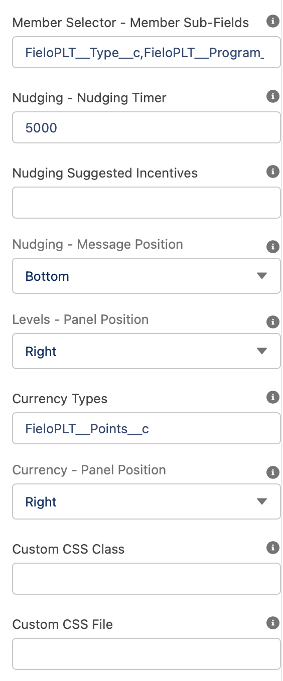
Member Selector - Member Sub-Fields
This setting allows you to define which Member field data will be displayed by the component below the 'Member Fields'. To do so you need to list the API names of the field(s) separated by a comma. It is common to show the member's program, account or type.
Nudging - Nudging Timer
This setting controls how often the member will be prompted to check out available incentives they can participate in. The time is set in milliseconds. By default, it is 5000 milliseconds (5 seconds). If you set it to 30 seconds, enter 30000 in this field.
Nudging Suggested Incentives
Use this setting if you want the Nudging component to show specific "Suggested Incentives". To do so you must place the Incentive(s) ID(s) separated by a comma.
Nudging - Message Position
This setting controls the position where the Nudging message will be shown. Choose between the bottom, right, left, and top.
Levels - Panel Position
This setting controls where the Level journey modal (displaying all program levels) will appear. Choose between the bottom, right, left, and top.
Currency Types
Enter the name of all of the currencies you want to display for your members' balances. If you add more than one, add a comma between each currency name.
Currency - Panel Position
This setting controls where the currency panel will appear. You can choose between the bottom, right, left, and top.
Auto Refresh (ms)
This field will control the frequency (in milliseconds) with which the component should refresh to show any new items. If left blank (or empty), the component will not auto-refresh.
Custom CSS Class
This allowed Custom CSS Classes to be applied in the main element, separated by space. Work with your IT department to update this with their customized CSS code.
Custom CSS File
This allowed a CSS file to be imported from a static resource. Work with your IT department to include the customized CSS information.
Working with Individual Components Separately
When you look at all of Fielo's components, you'll see that each of the elements can be added independently of one another. If you want, you can just add a couple from here, but they will stack on top of each other instead of being shown inline. By removing them from the menu of the Member Overview component, you can keep them in line for a cleaner look.
Updated over 1 year ago