
Making a Report
How to make Reports
A Report is a list of records that meet the criteria you define. It’s displayed in Salesforce in rows and columns, and can be filtered, grouped, or displayed in a graphical chart.
Creating a Report
To create a Report, go to the Reports tab of your ORG and click on New Report in the top right corner.
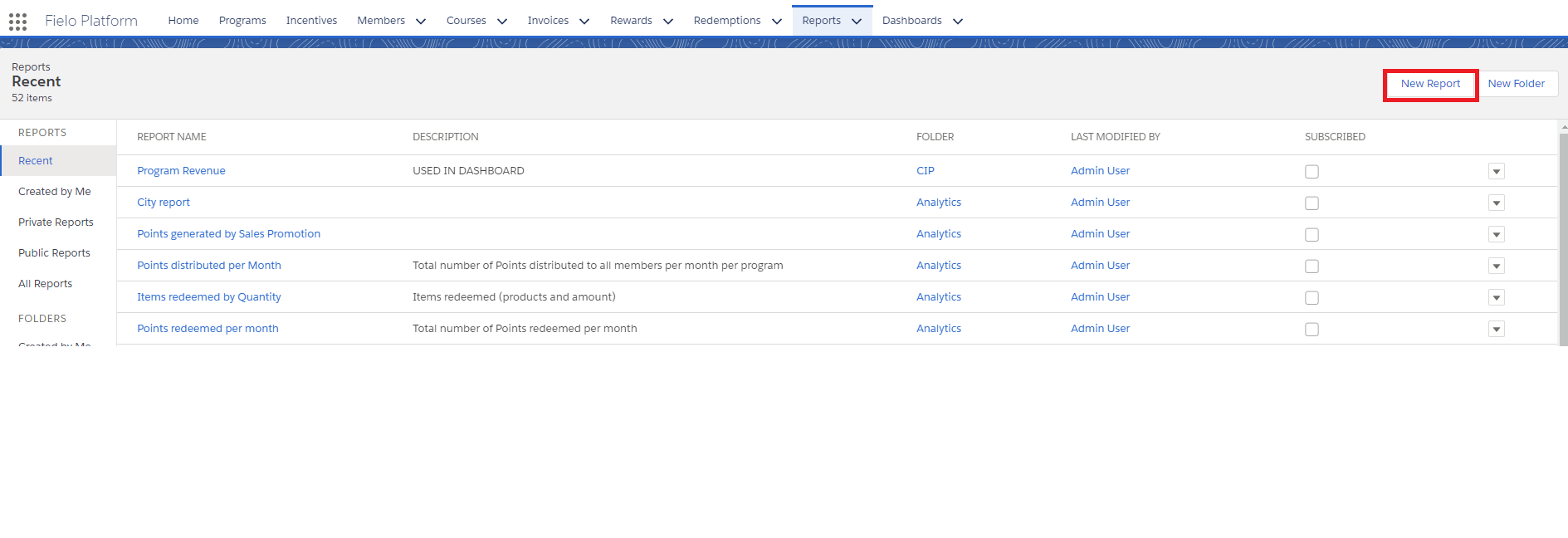
New Report
Choosing a Report Type
A Report Type defines the set of records and fields available to a Report based on the relationships between an object and its related objects. Reports display only records that meet the criteria defined in the Report Type. Fielo provides a set of pre-defined standard Report Types. Select the Objects you want to create your Report around.
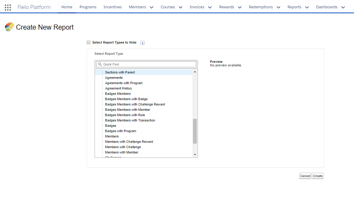
Report Type
Among many available options, you can create Reports on:
| Name of Report | Report Description |
|---|---|
| Active Members* per month perProgram**. |
|
| Active Points. | The total number of Active Points in the Program. |
| Breakage per month. | The number of Expired Points in the Program. |
| Items redeemed by Quantity. | Items redeemed (products and their quantity). |
| Items redeemed by Sum of Points. | Items redeemed (sum of Points). |
| Count of Members who have redeemed their Points. |
| New Members per month. | The number of new Members in status "Active" per Program per month. |
| Total number of Points distributed to all members per month per program |
| The number of points generated per Challenge. |
| Number of Points generated per Promotion . |
| Number of Points generated per Promotion . |
| Total number of Points redeemed per month. |
|
|
| Items redeemed by Quantity. |
|
|
|
| The number of Members that have a Course not finished. |
| The number of Members that started a Course. |
| Active Courses. | Number of active Courses. |
Once you've selected the Report Type you want, click Create.
Filtering a Report
You can also add filters to your Report so that only certain demographics or elements of a certain object are shown. Do this by clicking Add and then typing in the Filter criteria. In the below example, a filter has been created so that only Completed Redemptions are shown.
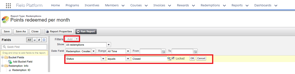
Adding filters
For a complete guide on Salesforce Reports, check out Reports & Dashboards for Lightning Experience.
Transactions and Members Report
We're going to give you a walk-through of a commonly made report so you can see how it's done. The report is: Transactions and Members.
As you can see, you're asked what you want to show: we picked All Transactions.
The below example shows what you'd do if you wanted your Report to only show Active Members. Drag and drop Member: Status from the left into the blank Filter box, then click the and select Active.
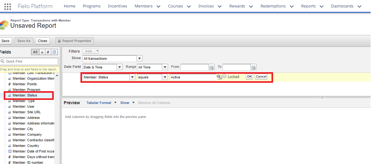
Filtering by Active Members
Now, along the left-hand side you can see a whole load of fields which you can select to build your Report around. Drag and drop the Fields you want included from the right along to the Preview box.
If there are already columns in the Preview box when you begin making your report, remove them by dragging and dropping them back into the fields bar along the left.
In the example below Member: Program - the Program the Transactions come from - has been dragged over, along with Member: Member Record.
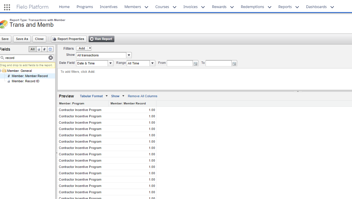
Program and Member Record
Then, you want to make sure that your report is Grouped around the Program, so click the by the Member: Program column, and click Group by this field.
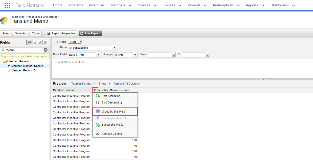
Group by this field
Once you've grouped by a given Field, the Report will automatically change to Summary format.
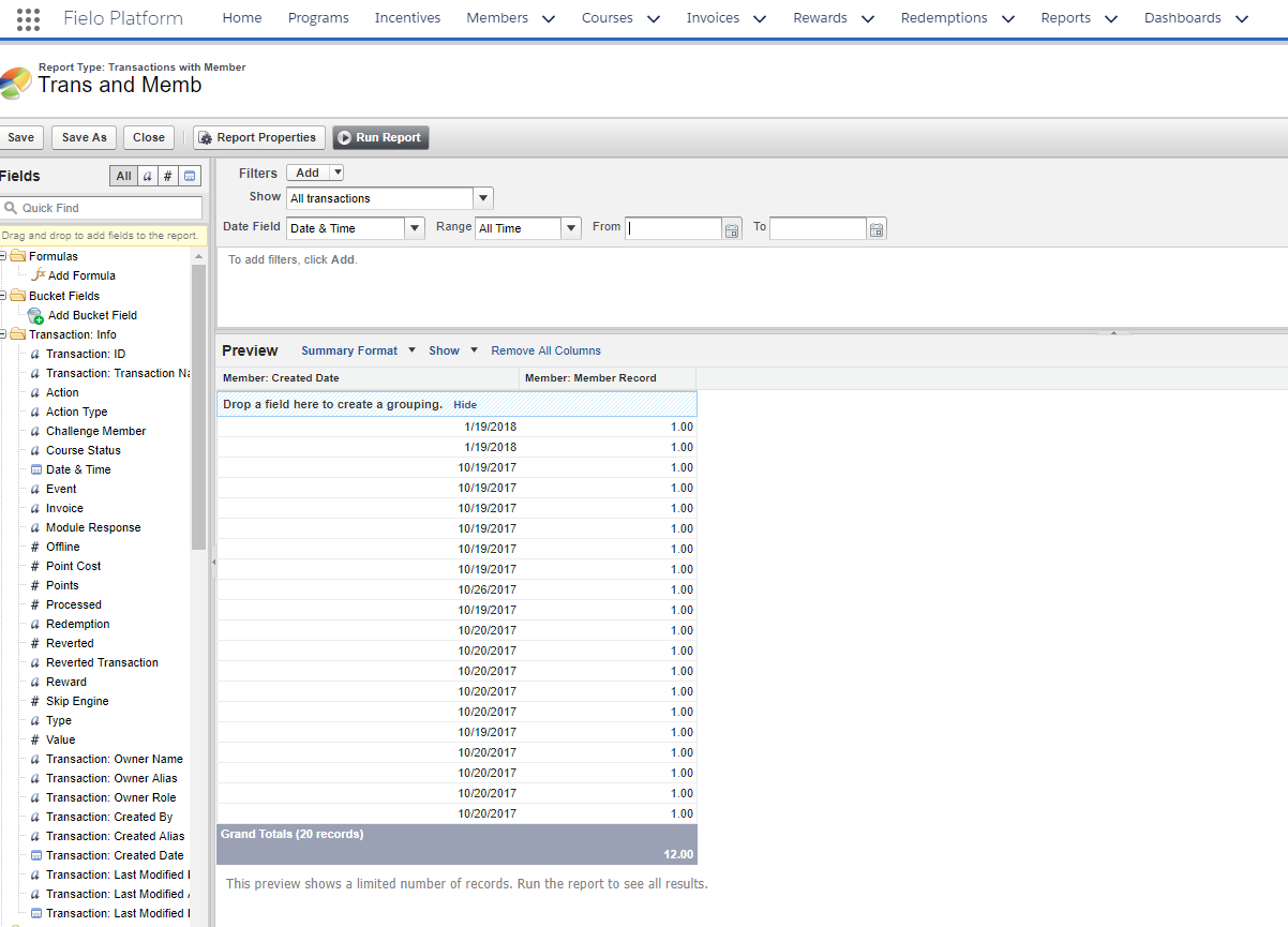
Summary format
You can then still add in Fields to base your Report around. For example, for the above Report, you might want to see how many Members performed Transactions by date. To do that, drag and drop the Transaction: Created Date Field over into the summary chart.
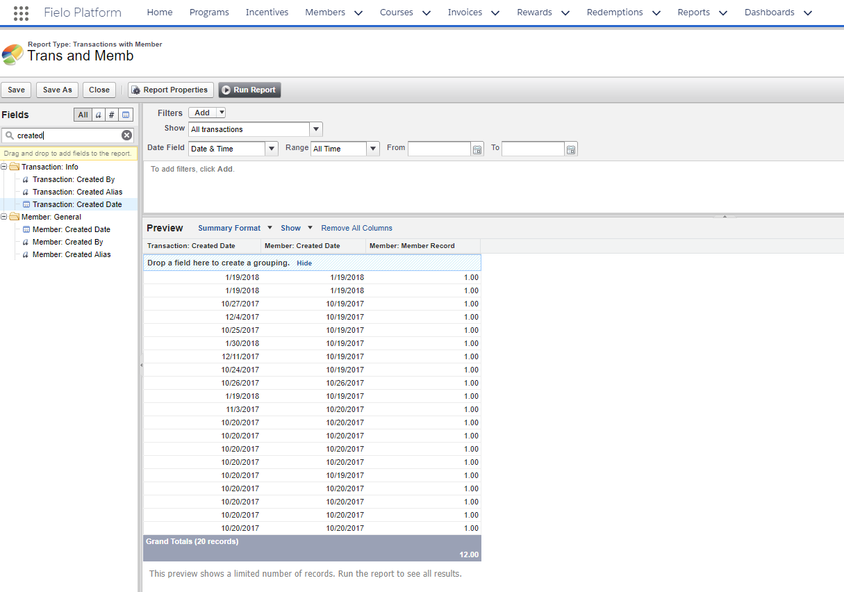
Adding Fields to Reports
Then group the summary by the new field you added: Created Date, by clicking on the by its name, and selecting Group by this field. Your data should then look something like this:
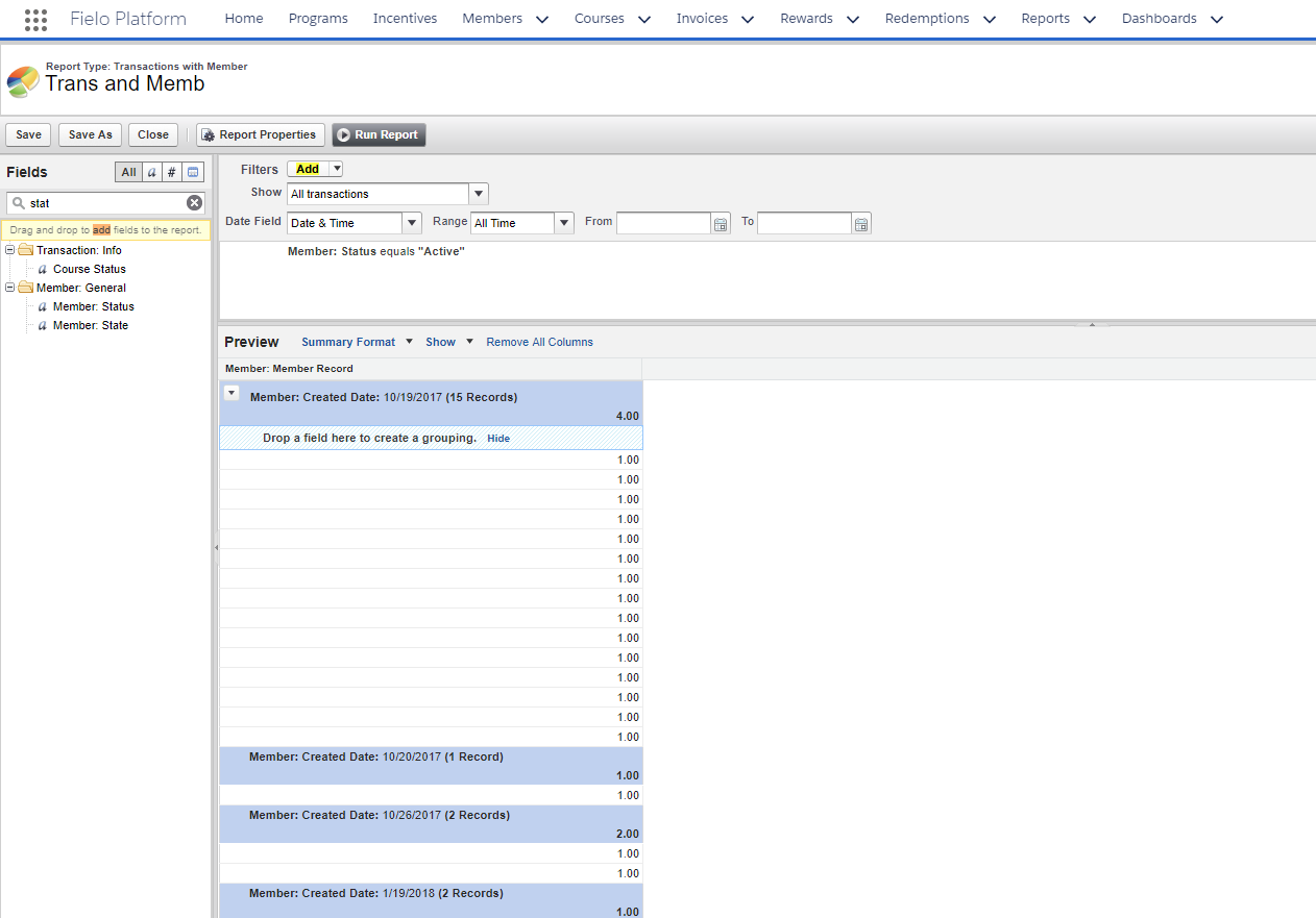
Grouped by Created Date
Once you're happy, you can Run Report:
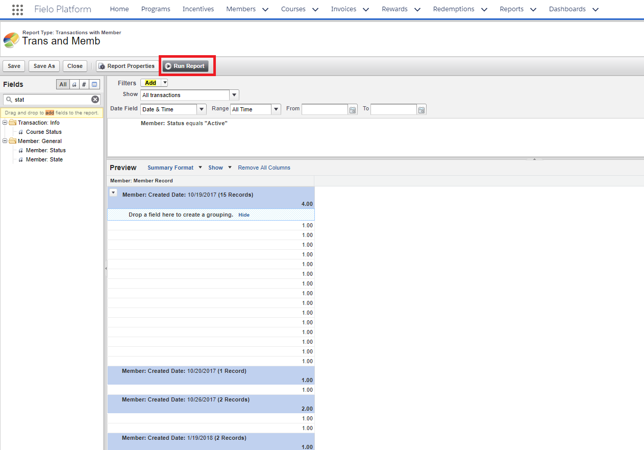
Running a Report
Your data will then appear in a new screen - congrats, you have successfully run your Report! Now you can organize your Report data into an appropriate Chart. Do this, by selecting the chart icon in the top right corner:
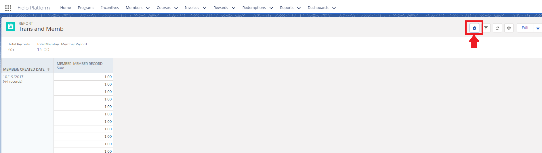
Make a Chart
Once you're taken to a new page, you can select the chart type that works best with the data you're presenting:
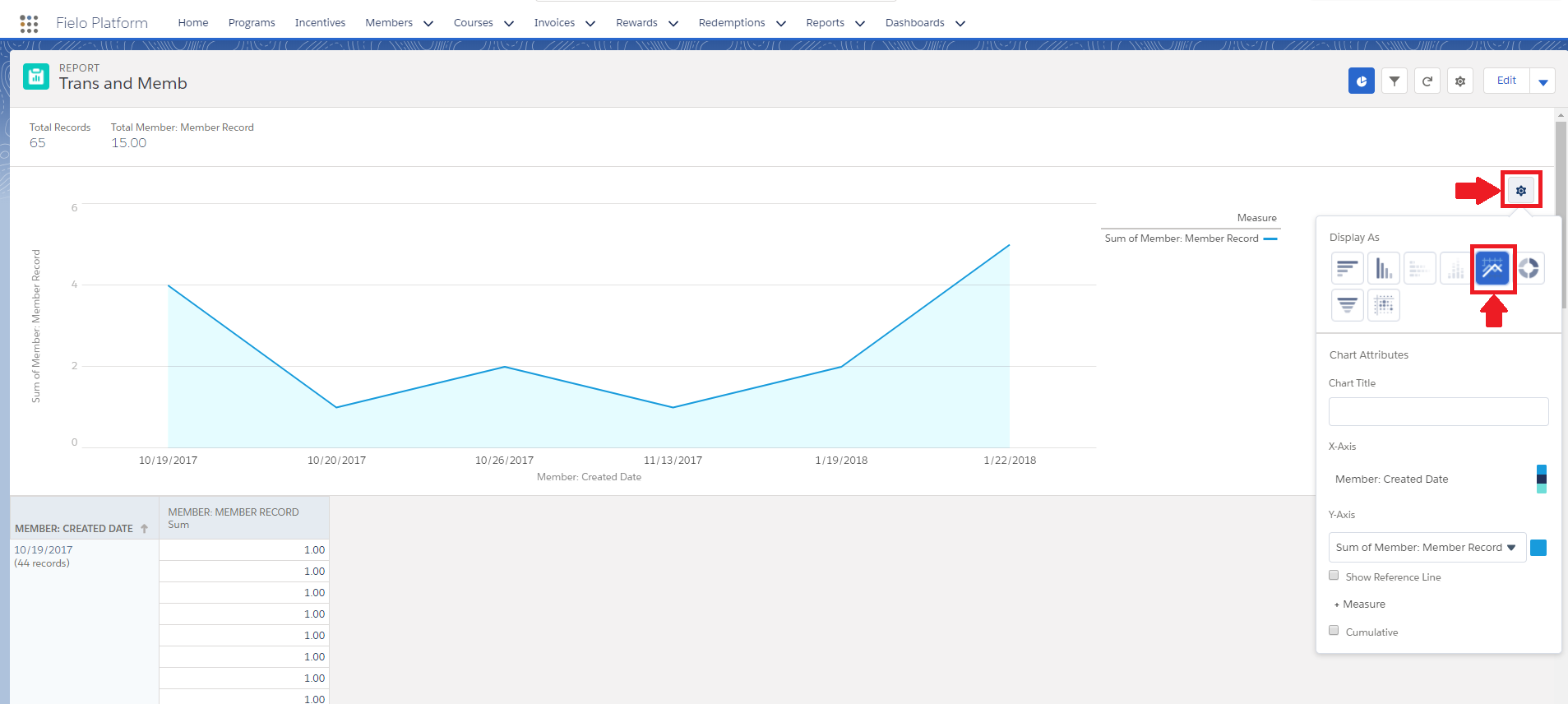
Choosing your Chart
Then, all you need to do is Save; and voilà, your chart is ready to be added to your Reports and Dashboards!.
Updated over 1 year ago