
Assistant
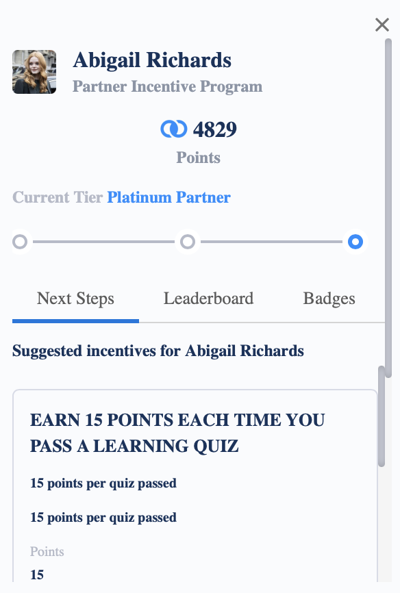
The Assistant component provides a way of placing many of your Fielo components in one place instead of presenting them on specific sections on a page. The floating icon houses all of your active components, so when a member clicks on it, they can view whatever details you make available to them. The following elements can be found in the assistant: Member Selector, Currencies, Levels, Next Steps (Nudging info), Mission Leaderboard, and Badges.
Note: Any Additional Rewarding (Custom Rewarding Reflection Class) defined on incentives will not be displayed on the component.
The following is what the Assistant looks like, including the icon. You are able to set where it appears on the page.
How It Works
When a member places their mouse on the Assistant, they will see all of the elements that you have enabled, such as member info, next steps (suggested incentives), leaderboards, and badges. They will be able to scroll through it to find the items that they want to check.
Setting up the Assistant Component
Since this component contains a lot of other components, there are several properties to review. Let's get started.
Make sure to add Fielo MX - Member Selector” component on the pageIn order for any Fielo MX Component to work, you need to add the “Fielo MX - Member Selector” component on that page (or the “Fielo MX - Member Overview” with the Member Selector sub-component set). You can find more information here Member Overview.
Mode
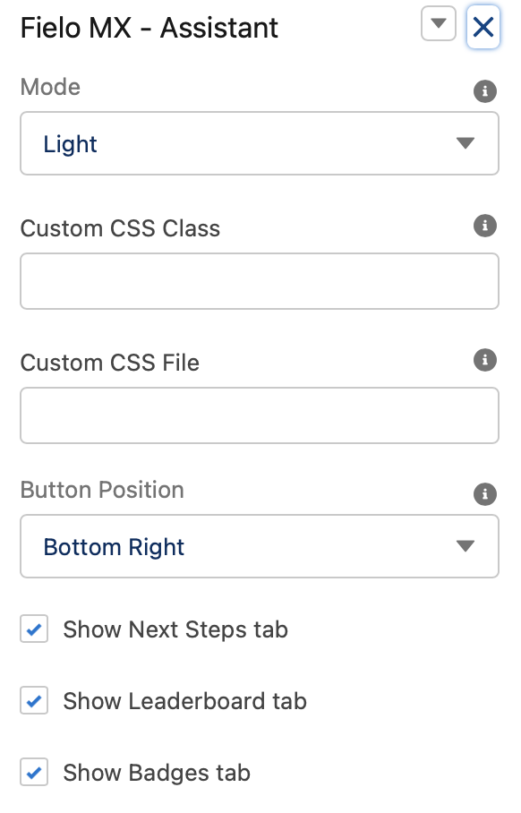
This field controls the overall look and feel of the component. We can choose between two settings: Light or Dark.
Custom CSS Classes
This allowed Custom CSS Classes to be applied in the main element, separated by space. Work with your IT department to update this with their customized CSS code.
Custom CSS File
This allowed a CSS file to be imported from a static resource. Work with your IT department to include the customized CSS information.
Button Position
This field controls on which part of the screen the assistant will be anchored to. You can choose:
- Bottom Right
- Bottom Center
- Bottom Left
- Center Right
- Center Left
- Top Right
- Top Center
- Top Left
Show Next Steps Tab
Check this field if you want to display the Next Steps tab. The next steps tab shows the same information as the Nudging component and provides a quick look at current incentives that are in progress and incentive rewards that the member could potentially earn.
Show Leaderboard Tab
Check this field if you want to display the tab for Mission Leaderboard. It is checked by default.
Show Badges Tab
Check this field if you want to display the tab for Badges. It is checked by default.
Custom Button Image Path
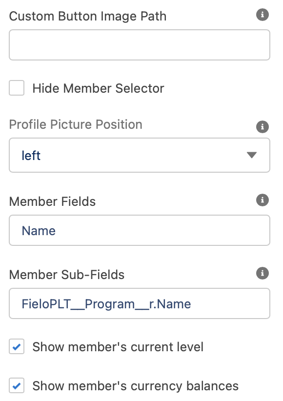
This field stores the assistant button image. You can add your own image for your floating Assistant like your company's logo or something else that will catch your members' eyes.
Hide Member Selector
This shows member selectors if you have it enabled. It is checked by default.
Profile Picture Position
Decide where you want the members' profile image to appear:
- Left
- Top Left
- Top Center
- Hidden
Member Fields
Enter the name of all of the component that you want to appear first in the assistant. If you add more than one, add a comma between each of the component names.
Member Sub-Fields
Enter the name of all of the component that you want to appear in the secondary positions of the assistant. If you add more than one, add a comma between each of the component names.
Show Member's Current Level
Displays the member's level. It is checked by default.
Show Member's Currency Balances
Displays the member's currency balance. It is checked by default.
Currency Types
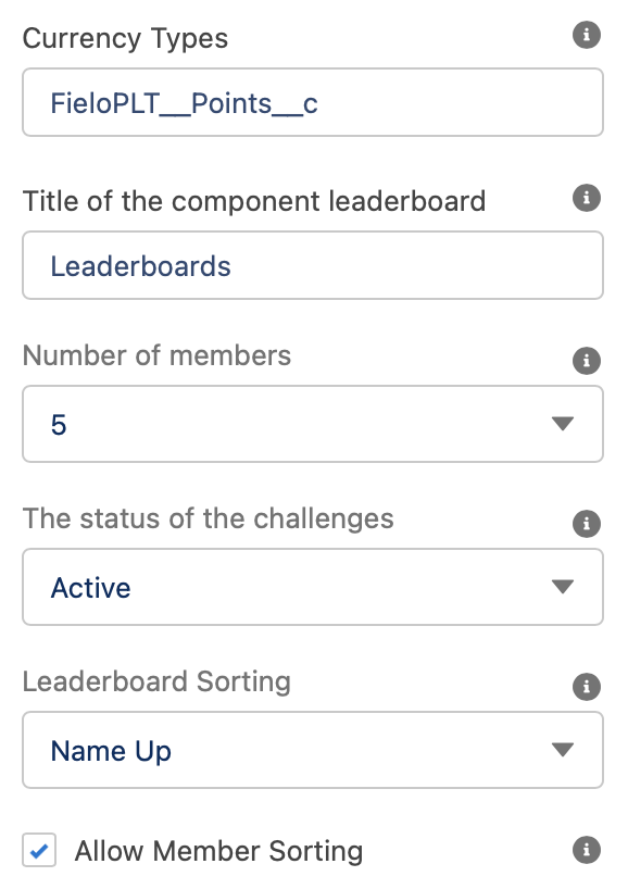
Enter the name of all of the currency that you want to appear for your members' balances. If you add more than one, add a comma between each currency name.
Title of the Component Leaderboard
This text field will contain the Title Label. Leaderboards will be its default value. An administrator user can customize the message by defining a Salesforce custom label value to be shown instead.
Number of Members
You can choose how many members will participants appear on each leaderboard, with the maximum number of names being 20.
The Status of the Challenges
This picklist field determines the status of the Challenges that will display.
- Active when selected, the component will show active missions leaderboards.
- Ended when selected, the component will only display completed missions.
- Both - when selected, the component will render both active and complete mission leaderboards
Leaderboard Sorting
If sorting is enabled, you can set the default sorting value for the component. These values can be:s participants can use in their sort.
- Name Up this will sort all leaderboards by leader name in ascending order. This is selected by default.
- Name Down this will sort all leaderboards by leader name in descending order.
- My Position Up this will sort all leaderboards by the member's position on the leaderboard in ascending order.
- My Position Down this will sort all leaderboards by the member's position on the leaderboard in descending order.
- Last Activity Up this will sort all leaderboards by the member's last activity in ascending order.
- Last Activity Down this will sort all leaderboards by the member's last activity in descending order.
Allow Member Sorting
UncheckChecking this option if you don't want to allow members to change the sorting value of the component.
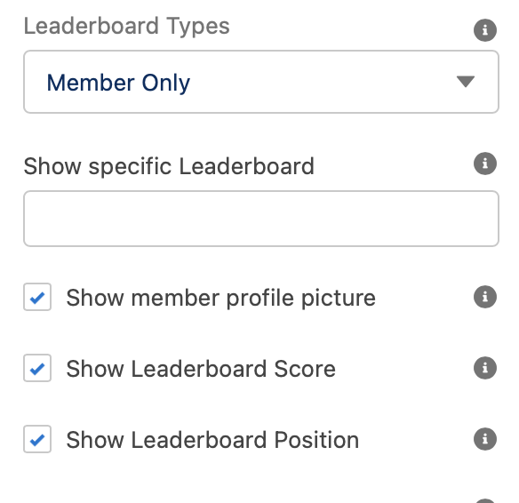
Leaderboard Types
You can select which mission leaderboards the member will be able to see: This lets you choose who will appear as a part of the leaderboard.
- Member Only select this option if you want Members to see only the Mission leaderboard they are (or had) participating. Selecting this will show only members. It is the default setting.
- Related Organization Member Only select this option if you want Members to see mission leaderboards in which their related Organization Members are (or had) participated. Selecting this will anonymous individuals and contributor members related to other organizations.
- Both select this option if you want to display both want that Member’s mission leaderboards as well as the Member's Related Organization mission leaderboards.
Show Specific Leaderboards
This field allows you to specify which mission leaderboards you want the component to display. You must enter the Id of the mission leaderboards (you want to show) separated by a comma (Id 1, id 2,...id N).
Note: Making use of this feature will disable the "Pagination" and "Page Size" properties.
Show Member Profile Picture
This shows the members' or partners' profile image.
Show Leaderboard Score
This shows the members' or partners' scores.
Show Mission Leaderboard Position
This shows the members' or partners' rank on the leaderboard.
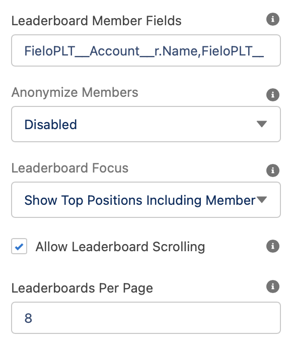
Leaderboard Member Fields
Use this field to specify which Member field information you want to show. You must enter the field API name separated by a comma (Field1c, Field2c,..., FieldN__c).
Anonymize Members
This field allows you to anonymize the Member information shown by the component. You can choose:
- Disabled - All Member details will be shown.
- Individual Members Outside Organization - Only Member information of those inside the member organization will be displayed.
- All Members - Leaderboard participants will only be able to see their own details. Every other participant will have their information hidden.
Leaderboard Focus
This lets you control how the leaderboard positions are viewed by default. You can choose between:
- Show Top Positions Including Member - This will show the members in the top positions. If the member does not belong to the top positions then will add the member, letting them see how close they are to reach the top positions.
- Show Top Positions - This will show only the people in the top positions.
- Show Neighbors - This will show where the Member is in the center of the leaderboard. Allowing them to see which members are above and below on the leaderboard.
Allow Mission Leaderboard Scrolling
Uncheck this option if you don't want to allow members to load additional data on the mission leaderboards. Allowing them to click on “show more” and view how the other members are doing.
Leaderboards Per Page
You can choose how many mission leaderboards are viewed on a page at the same time.
Text Orientation:
This picklist setting will control the overall look and feel orientation:
- Left to Right this is the default value. When selected, all elements will be rendered from Left (first) to right (second.)
- Right to Left when this setting is selected all elements will be rendered from the right (first) to left (second).
Updated over 1 year ago