
Badges
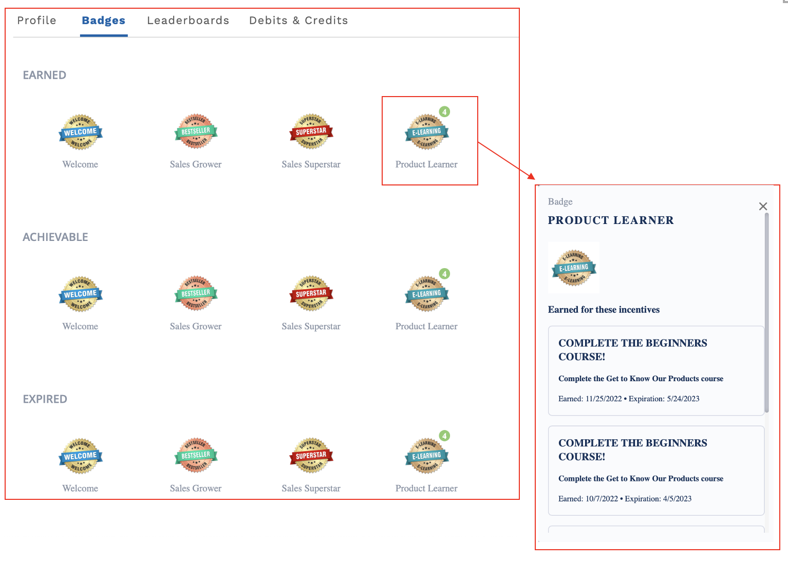
Badges component[Fielo MX - Badges] gives your members a place where they can view all badges. A Member can view the badge details, which can include information such as the name of the incentive awarded and can award such a badge. Badges are groped by status:
-Earned will show all the active badges the member has. These are badges the member has earned but have not expired yet.
-Achievable will show all badges the member can earn by engaging in an incentive.
-Expired will show all badges the member has earned but had expired.
Note In the following image, the Badges component has been added to the existing Salesforce Tabs component. You can place the component anywhere you want on a page.
Setting up the Badges Component
When you drag and drop the component onto your preferred page, you can begin setting the values for the fields. This is a fairly easy component to manage as there are only a few fields for you to set before you release it to your members.
Make sure to add Fielo MX - Member Selector” component on the pageIn order for any Fielo MX Component to work, you need to add the “Fielo MX - Member Selector” component on that page (or the “Fielo MX - Member Overview” with the Member Selector sub-component set). You can find more information here Member Overview.
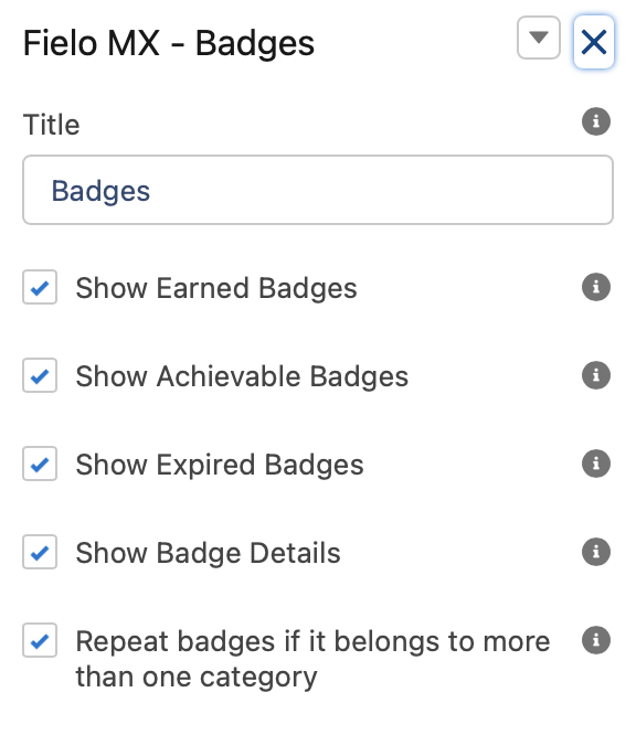
Title
This text field will contain the Title Label. “Badges” will be its default value. An administrator user can customize the message by defining a Salesforce custom label value to be shown instead.
Show Earned Badges
Uncheck this field if you don't want the component to show the "Earned" badge section. Earned badged shows all active badges the member earned.
Show Achievable Badges
Uncheck this field if you don't want the component to show the "Achievable" badge section. Achievable badges are badges the member can earn by engaging in an incentive.
Show Expired Badges
Uncheck this field if you don't want the component to show the "Expired" badge section. Expired badges are badges the member earned in the past but have expired (meaning they are no longer active).
Show Badge Details
Uncheck this field if you don't want the badge to show details when a member clicks on it. allows the member to click on the badges to get details. If this is unchecked, members won't be able to click on the badges. Badge detail shows information like the incentive that awarded (or can award) a badge as well as earned and expiration date.
Repeat Badges If It belongs to More Than One Category
By default, the badge component will only show badges in one section (earned, achievable, or expired). Checking this field will make the component show the same badge in more than one section (when applicable).
This means that (for example) if one badge that was earned and is also available is to be earned again (by default) the component will only show it in the "Earned" section (and not in the "Available" section).
Page View Mode
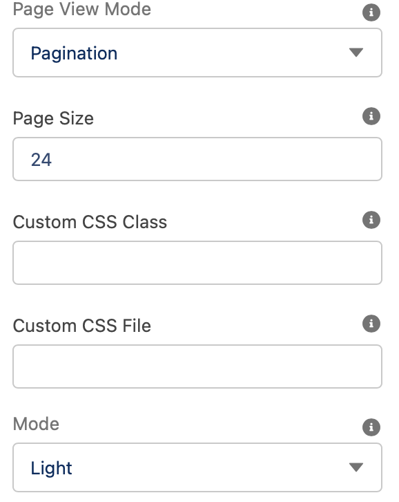
If there are multiple elements to be shown, this setting will control how the badges pagination will work:
Pagination provides left and right arrows, as well as a page number so that members can page through all of their available badges. This is typically better if you tend to have a lot of badges available to your members. The page number and the total number of pages will be displayed at the bottom of the component. Allowing members to move back and forward the different pages.
List provides a Show More option at the bottom of the screen so the member can expand the number of badges displayed. They can keep clicking on Add More until all badges are displayed. This is better when there are typically only a few more badges that are displayed on a page or two.
Page Size
You can specify how many badges you want to be displayed on a page or as a part of the initial list.
Custom CSS Classes
This allowed Custom CSS Classes to be applied in the main element, separated by space. Work with your IT department to update this with their customized CSS code.
Custom CSS File
This allowed a CSS file to be imported from a static resource. Work with your IT department to include the customized CSS information.
Mode
This field controls the overall look and feel of the component. We can choose between two settings: Light or Dark.
Text Orientation:
This picklist setting will control the overall look and feel orientation:
- Left to Right this is the default value. When selected, all elements will be rendered from Left (first) to right (second.)
- Right to Left when this setting is selected all elements will be rendered from the right (first) to left (second).
Updated over 1 year ago