
Command Center
Find all the analytics data from your program in one place
The Command Center gathers the dashboards related to all the reports that come with the Fielo package, offering you an easy way to access them and to overview each program's statistics. This is where you will find all the data you might need to help you make better and intelligent decisions related to your program.
Imagine, for example, that you want to check the number of new members that have entered the program in the last month. Or, that you want to know which segment is the most engaged with the program. Or, better yet, you want to know exactly how many points have been delivered and take a look at a budget report... Every important piece of information that you need, be it related to the member's engagement or to how much you are spending with the program, you will find in one place.
Other than that, the dashboards are divided by category, so that you won't need to look all over to find a specific report:
- Program
- Incentives
- Members
- Financial
The command center is located within the Home tab, which makes it the first thing that you will see whenever you enter the platform, placing the reports in the spotlight of Fielo Platform. Moreover, if you have more than one program, you can change from one program to the other by clicking on the right next to the program name at the top bar and selecting it.
Now that you understand what the command center is and its objectives, let's see some more details and explain some concepts.
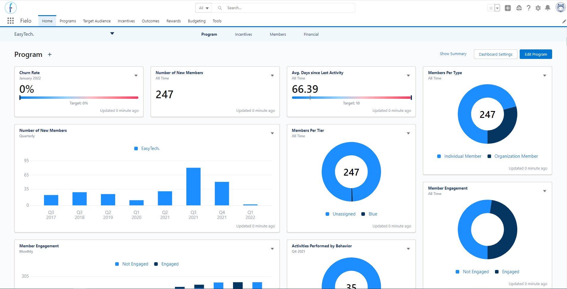
Command Center
KPIs
Fielo Analytics is a feature that, at its core, works based on what we call KPI and KPI Domain. At a high level, the KPI brings the reports that are stored within Salesforce to the command center's dashboards, while the KPI Domain converts their data to look like what we want them to and does the association between the KPI (i.e. the report) and a specific program or incentive.
All the reports that Fielo makes available through the package will be automatically added to the dashboards as KPIs. It is not possible to add more or to change their chart type.
The dashboards have a default setting that allows everyone to see it in the same way: with the exact same settings. However, as soon as a User changes any KPI Setting through the command center for the first time, a custom version of the dashboard will be created, stored in the KPI Domain, and related to the Salesforce User.
The dashboard view will also be related to your programs and incentives so that you can save different settings for each of them - such as different targets. This process makes it possible to create a dashboard view that is linked to you, so that every time that you access the command center afterward, it will look the same as you have set it up before.
If you want to reset them, though, you can: click on Dashboard Settings and hit the Reset Dashboard button. That specific dashboard will go back to the default settings.
KPI Settings
To edit a KPI's configuration, click on the at the top right corner of the tile and then click on KPI Settings. You will see the KPI's options that you can change so that it is displayed the way that you prefer.
Check the settings options below, but note that not all of them are available to all chart types.
-
Target
Set a quantifiable objective for the KPI, so that you can see how far you have come in reaching or surpassing them. The Dashboard's tooltip (i.e. mouse over) will display the target number, as well as the reached percentage so far. -
Time Unit & Accounted Period
Define the period that the KPI's data will be related to. Make sure to choose the time unit (weekly, monthly, quarterly, yearly, or all-time) first and, then, select the accounted period that you want the KPI to cover. For example, if you choose yearly as the time unit and 1 year ago as the period, then the KPI will only display the data related to the last year. Depending on which year you are currently in, the year displayed will change: it will always be 1 year ago (or one week/quarter/month ago).
If the Time Unit is set to "All Time", then the KPI will show the data related to all the time in which the program has been active. You won't need to choose an Accounted Period. -
Number Format
There are two options within this: decimal or percentage. If you prefer to see all KPI numbers in their percentage format, rather than as decimals, then select percentage. Since the percentage is calculated based on the target, be sure to set a target if you choose this option. -
Include only active members
If inactive, then the KPI will take into account all the members, no matter in which status (active, submitted for approval, rejected, pending user, pending merge, blocked, opt-out, anonymized, banned, or merged) they are on. If active, which is the default, the results will be related only to the active members. -
Show Total
It shows the total number when active . -
Show Detail
It shows the numbers divided by each period (accounted period) when active . -
Number of Results
Within the List chart type, you can choose the number of rows displayed: it can be any value from 1 to 200 rows (lines). If you choose a number lower than the total quantity of records that could be shown, then the KPI will display only those with the highest results. For example, it will display the top 10 redeeming members if you enter "10" in Limit, even if there are 100 members in your program. -
Color Gradient Variant
This is a visual configuration. In the Progress #2 chart type, the progress bars have colors and you can decide if they go from blue to red (default) or from red to blue (inverse).
KPI Appearance
As mentioned before, Analytics gets all the data from the Salesforce reports and displays it in a way that makes it easy for you to understand them at a glance. That is why the KPIs will assume the chart form that works the best for the type of data that is being delivered.
The chart can be one of these types:
- Progress: shows the basic numbers related to the report. A progress bar will be displayed if you set a target (i.e. a quantifiable objective).
- Progress #2: similar to the progress, but in this one, the bar will have a small vertical line marking where the target is, comparing it to what your program has achieved so far. If the target hasn't been reached yet, the mark will be at the end of the bar.
- List: shows a simple list of related data and its numbers, from the register that has the highest amount to the lowest, from top to bottom. For example, a list of all the segments and the number of active members in them.
- Progress list: this one is similar to the list chart, but with progress bars. The bars are displayed from the greatest number to the lowest, from top to bottom.
- Donut: the classic donut chart displays how a whole is divided into several parts, representing a percentage distribution. If there are more than 6 parts, the top 5 are displayed and the remaining are grouped as "others".
- Bar: shows the relationships between different data series that are independent of each other, where each one of them is represented by bars of varying heights. The chart displays up to 12 bars ordered from the closest date to the furthest, from left to right. If there are more than 6 groups, the top 5 are displayed whereas the remaining are grouped as "others".
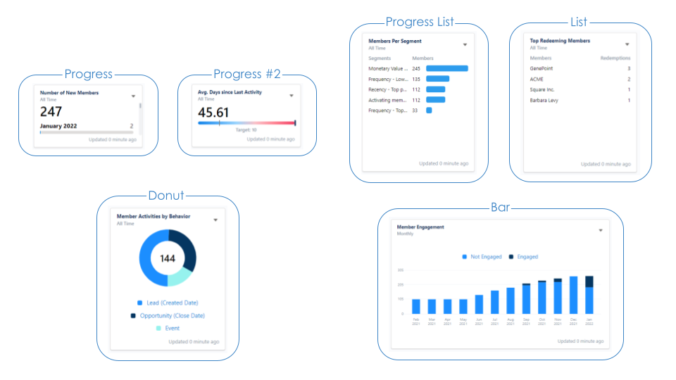
Charts examples
About KPI
Click on at the top right corner of the tile and select About this KPI to see the KPI's description.
This option allows you to have easy access to a brief description of the data that each report delivers, as well as how the results are calculated and to which fields or objects it is related (if applicable).
Update KPI
The KPIs in each dashboard have their data automatically updated whenever you reload the page, but it is also possible to click on Update all KPIs to reload all reports in the dashboard, or to click on Update this KPI to update a specific KPI. This last option is available within the on each KPI tile.
You will find the date referring to the last time each KPI was updated on the tile's footer.
Asynchronous KPIsIf Fielo's engine has any trouble when trying to retrieve a great amount of data to update a KPI, that specific KPI will be changed from being updated through a synchronous process to asynchronous (i.e. it will only be updated manually).
Other than that, an error is displayed within the tile if the KPI can't be turned to async.
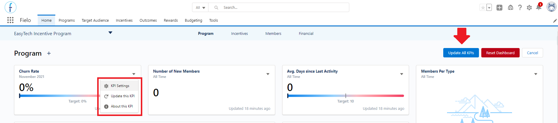
KPI settings, update, and description.
Hiding Specific KPIs
The program administrator also has the option to show or to hide specific KPIs from the command center's dashboard.
For that, go to the FieloAnalytics library within the Tools tab, and click on Manage KPI. In the form that will appear, uncheck in the list the reports that you don't want to be displayed in the dashboard and Save. Note that this action will apply to all Users.
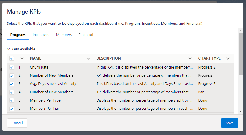
Manage KPIs from the Analytics library
If you'd like to use Salesforce's native features to see the reports, or to create more reports, take a look at Making Salesforce Reports and Salesforce Dashboards.
Reports
As mentioned before, you will notice that the command center divides the reports into some sections. Let's see more details on what each tab displays and a description of all Fielo default KPIs per tab below.
Program
Within the Program tab, is where all the most important reports related to the program are at - you might see some reports repeated in other tabs. It is possible, for example, to take a look at the number of members that have joined the program and the number of activities performed split by the behavior types that they are related to.
You can see reports from other programs by using the program selector at the command center menu. From there, it is also possible to create or edit a program, or to check the program details by clicking on the Show Summary button.
Program reports description
| Report Name | Description | Chart Type |
|---|---|---|
| Number of New Members | KPI delivers the number or percentage of members that have joined the program. The data is retrieved based on their Joined Date and is split by date (each year, quarter, month or week). | -Progress -Progress #2 -Bar |
| Members Per Tier | Displays the number or percentage of members in each level of the program. If the member doesn't have a level, they will be Unassigned. | -Donut |
| Members Per Type | Displays the number or percentage of members split by type: individual, organization or contributor. | -Donut |
| Top Redeeming Members | This KPI shows the top program members who have performed the highest amount of redemptions. It does not take into consideration the redemptions created by an instant reward. | -List |
| Activities Performed By Behaviors | Displays the number or percentage of activities performed in total or by behavior type. The data is retrieved based on the members' transactions and trackers. It considers only the processed transactions generated by a promotion and without a type. Reverted transactions are also included. The behavior type is identified by the incentivized object's name. | -Donut -Bar |
| Points Expiration Rate by Tier | From all points given in the program, this KPI shows which percentage or number of those points have expired (i.e. Points from an expiration transaction). Grouped by the member’s current level. | -Donut |
| Points Redemption Rate by Tier | From all points given in the program, this KPI shows which percentage or number of those points have been redeemed (i.e. closed redemptions). Grouped by the members' current level. | -Donut |
| Member Engagement | This KPI retrieves every transaction and trackers related to incentives and summarizes how many members have performed an activity in a given period. Adjustment, reversion, expiration and challenge reward transactions are not considered. The Donut chart does not display a total number. | -Donut -Bar |
| Top Engaged Members | This KPI summarizes each members' activity in the program (every transaction and trackers related to incentives) in a given period. It displays the result as a ranking of the most engaged members to the least engaged. Adjustment, reversion, expiration and challenge reward transactions are not considered. The list can show up to 100 members. | -List |
| Churn Rate | It displays the percentage of the member churn in the program. The rate is calculated using the By default, it shows data month by month, and doesn't allow the All Time or Current time options. | -Progress #2 |
| Average Days Since Last Activity | This KPI is based on the Last Activity and Days Since Last Activity fields, which stores the date and the number of days since the member has last interacted with the program. Those fields are updated according to the last transaction (that isn't an adjustment or reversion type) created by or related to the member. | -Progress #2 |
Incentives
In the Incentives tab of the command center, you will find the reports related to all the promotions and challenges that you have in a program. The reports include data on the members' engagement with the incentives - such as the number of rewards given -, and you can navigate between the reports related to each incentive you have in a program using the selector located right under the command center menu.
Moreover, if you want to create a new incentive or edit the one that is currently selected without leaving, you can. Click on the ➕ to open the Quickstart Incentive and create a new incentive, or click on Edit Incentive to proceed with any change that you want to do.
You can also check the incentive's details by clicking on Show Summary. It is even possible to activate the incentive (if it is in a draft or inactive status), inactivate it (if it is active or scheduled), or apply changes (if edited) from the summary.
Note that in the Incentives tab, you select the program and the incentive that you want to see the data from. The reports displayed will be related to the selected incentive only, not to all the incentives in the program.
Incentives reports description
| Report Name | Description | Chart Type |
|---|---|---|
| Activities Performed by Behavior | It breaks down the quantity of activities performed by each behavior type used in the incentive selected. The behavior type is identified by the incentivized object's name. | -Donut -Bar |
| Rewards Given | It displays the total amount of rewards given through the incentive. The number of rewards are grouped in these categories: badges (quantity), instant reward (quantity), funds (total amount) and each currency (total amount). Reverted transactions are not considered. | -Donut -Bar |
Members
The Members tab will deliver all the reports related to the members in your program. Every data that you might need regarding the program members will be gathered in this place: how many members there are in a segment, the number of members in each status, the number of new members in the program, and much more.
The command center displays this tab only when both the Analytics library is enabled and Analytics is enabled for the specific program that you are seeing.
Members reports description
| Report Name | Description | Chart Type |
|---|---|---|
| Number of New Members | KPI delivers the number or percentage of members that have joined the program. The data is retrieved based on their Joined Date and is split by date (each year, quarter, month or week). | -Progress -Progress #2 -Bar |
| Members Per Tier | Displays the number or percentage of members in each level of the program. If the member doesn't have a level, they will be Unassigned. | -Donut |
| Members Per Segment | Shows the number of members in each active segment in your program. This KPI has the Show Total option disabled by default. You need to Enable analytics when creating the segment for the KPI to display data. | -Progress List |
| Members Per Status | Shows the number of members in each status: active, submitted for approval, rejected, pending user, pending merge, blocked, opt-out, anonymized, banned or merged. This KPI has the Show Total option disabled by default. | -Progress List |
| Top Engaged Members | This KPI summarizes each members' activity in the program (every transaction and trackers related to incentives) in a given period. It displays the result as a ranking of the most engaged members to the least engaged. Adjustment, reversion, expiration and challenge reward transactions are not considered. The list can show up to 100 members. | -List |
| Members Engagement | It shows the percentage of members that are engaged in the program. The engagement is processed as every transaction and trackers related to incentives. | -Progress #2 -Bar |
| Member Activities by Behavior | This KPI displays the summary of activities performed by behavior type related to a specific incentive. The data is retrieved based on the members' transactions and trackers. | -Donut |
| Total Members | It displays the total number of members in the program. | -Progress |
Financial
The Financial tab will display all the reports that are focused on the financial aspects of your program. They will deliver information such as the total number of currencies given by the program, the number of payouts, and the rewards cost. It is a great and easy way for you to keep track of how much you are spending in each program, split by all the most important KPIs that you might need.
The command center displays this tab only when both the Analytics library is enabled and Analytics is enabled for the specific program that you are seeing.
Financial reports description
| Report Name | Description | Chart Type |
|---|---|---|
| Points Delivered | This KPI will show the total amount of currencies delivered throughout the whole program. It may be divided by currency (donut chart) or by date (bar chart). | -Donut -Bar |
| Points Expiration Rate by Tier | From all points given in the program, this KPI shows which percentage or number of those points have expired (i.e. Points from an expiration transaction). Grouped by the member’s current level. | -Donut |
| Points Redemption Rate by Tier | From all points given in the program, this KPI shows which percentage or number of those points have been redeemed (i.e. closed redemptions). Grouped by member’s current level. | -Donut |
| Payouts Fulfilled Per Incentive | It displays the amount of payouts given to members over time (bar) and per incentive (donut). This report takes into consideration only the payouts with Paid status, and the PaidDate. | -Donut -Bar |
| Redemptions Cost | This KPI displays each reward's cost within the program, based on its unit cost. It lists the rewards that have been redeemed by members, multiplying their quantity by their value. It does not take into consideration instant rewards. | -Progress List |
| Incentivized Behavior Types | This KPI delivers the number of incentivized (i.e. generated a transaction or tracker) and not-incentivized records related to an object, in a period of time. It will show the results corresponding to the active Behavior Types defined in the KPI Settings, from the last time that the batch ran up until yesterday. Note that only the Donut chart can show data related to all Behavior Types at once and that the data displayed comes from (and is updated by) the Calculate Behavior Statistics Batch, which verifies the Behavior Statistics object. | -Bars -Donut |
Updated over 1 year ago