
Learning (How to Configure)
Once you understand the member experience, you can start customizing the experience for your members. Make sure to refer back to the Learning - Member View if you would like more details about what these different settings do.
Provide Permissions
First thing's first: you'll want to provide your learners the permissions required to use Learning component. Go ahead and assign the Fielo Learning Community permission set to those users.
Configure Properties
Now, with permissions taken care of, you can configure the Learning component to meet the unique needs of your learners.
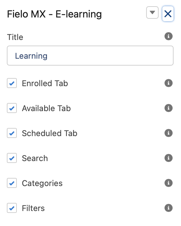
Title
This text field will contain the Title Label. “Learning” will be its default value. You replace it with any value that you want or assign a Salesforce custom label value to be shown instead.
Enrolled Tab
Check this box to enable the Enrolled tab. This will show all courses the member is or has enrolled in. If Custom Course Tabs are used this field will have no effect.
Available Tab
Check this box to enable the Available Tab. This will show all Available courses the members can enroll in. If Custom Course Tabs are used this field will have no effect.
Scheduled Tab
Check this box to enable the Scheduled Tab. This will show upcoming courses that will become available to members in the future. If Custom Course Tabs are used this field will have no effect.
Search
Check this box to enable members to search courses based on name (or part of it).
Categories
Check this box to enable members to filter courses by category.
Filters
Check this box to enable members to filter courses based on status, start date, end date as well as sorting (by name or start/end date).
Mode
This field controls the overall look and feel of the component. We can choose between two settings: Light or Dark.
Direction
This picklist setting will control the overall look and feel orientation.
- Left to Right: this is the default value. When selected, all elements will be rendered from Left (first) to right (second.)
- Right to Left: when this setting is selected all elements will be rendered from the right (first) to left (second).
Course List Style
This field controls the look and feel of the course card (shown in the course list screen). You can select between:
- Banner on Top
- Banner on Background
Course Name
Enter the API name of the field that you want to be displayed in the course name.
Course Description
Enter the API name of the field that you want to be displayed in the course description.
Show Course Status/Eligibility tag
Check this box if you want to show the eligibility tag of each course in the course list.
Show Course Start-End Dates tag
Check this box if you want to show the Start-End dates of each course in the course list.
Allow Course Favorite Bookmark
Check this box if you want to allow members to bookmark their favorite courses. If a member has courses marked as favorites the "My Favorites" category will be shown allowing them to filter.
Show Specific Course(s)
This field enables you to tailor the courses displayed by the component. Simply input the ID of the courses you wish to see, separated by commas.
Pagination
This lets you choose how you want additional courses to be displayed:
- Page adds left and right arrows at the bottom of the component so that members can page through additional courses.
- List adds a Show More button at the bottom of the component so that members can display all courses on a single page as a long list.
Page Size
Will control how many courses will be loaded per page (if greater, Show Next button will be displayed). By default, the number is set to 15.
Custom CSS Classes
This allowed Custom CSS Classes to be applied in the main element, separated by space. Work with your IT department to update this with their customized CSS code.
Custom Static Resource
This allowed a CSS file to be imported from a static resource. Work with your IT department to include the customized CSS information.
Course Status Fields
Enter the API names of the course status fields you wish to display in the course detail header, separated by commas. You may also include the default values of 'Course Status', 'Days Left', and 'Rewards' to display relevant course information in the header.
Module Status Fields
Enter the API names of the module status fields you wish to display in the course detail header, separated by commas. You may also include the default values of 'Status', 'Completed Date', 'Attempts', 'Grade', 'Correct Answers', 'Rewards', and 'Feedback' to display relevant course information in the header.
Closed Courses
This field determines the visibility of closed courses within the component. You can choose to:
- Show in Enrolled and Available: Choose this option to display closed courses on the "Enrolled" or "Available" tabs.
- Group and show all in Closed tab: Choose this option to group and display all closed courses, whether previously enrolled or not, in a new tab labeled 'Closed'.
- Don't show Closed course: Choose this option if you wish to hide closed courses from view in the component.
If Custom Course Tabs are used this field will have no effect.
Custom Course Tabs — 🆕R1 2026
Allows you to fully customize how courses are grouped and displayed within the Fielo MX eLearning component. You can define any number of tabs, control the order in which they appear, assign one or more eligibility statuses to each tab, and set which tab opens by default when the component loads.
Course Eligibility Statuses
Each tab can display courses in one or more of the following eligibility statuses:
| Status | Description |
|---|---|
| Completed | The member has completed the course. |
| In Progress | The member is enrolled and a progress indicator shows their overall completion. |
| Available | The member is eligible to start the course but has not done so yet. |
| Scheduled | The course is scheduled for a future date and has no unmet dependencies. |
| Dependency | The member does not meet the course's prerequisite requirements. Displayed until all requirements are satisfied. |
| Closed | The course is closed and the member did not complete it. |
Configuration Syntax
<Tab Name>:<Status1>,<Status2>; <Tab Name>(#):<Status1>,<Status2>; ...Rules:
- Separate each tab definition with a semicolon (
;) - Separate the tab name from its statuses with a colon (
:) - Separate multiple statuses within a tab with a comma (
,) - Append
(#)directly after a tab name to set it as the default tab on load - If no
(#)is specified, the first tab opens by default
Configuration Examples
Example 1 — 3 tabs, first tab opens by default
Available(#): Available, Scheduled, Dependency; Enrolled: In Progress; Completed: Completed, Closed| # | Tab Name | Opens by Default | Displays Statuses |
|---|---|---|---|
| 1 | Available | ✅ Yes | Available, Scheduled, Dependency |
| 2 | Enrolled | — | In Progress |
| 3 | Completed | — | Completed, Closed |
Example 2 — 4 tabs, third tab opens by default
Scheduled: Scheduled; Available: Available, Dependency; Enrolled(#): In Progress; Completed: Completed, Closed| # | Tab Name | Opens by Default | Displays Statuses |
|---|---|---|---|
| 1 | Scheduled | — | Scheduled |
| 2 | Available | — | Available, Dependency |
| 3 | Enrolled | ✅ Yes | In Progress |
| 4 | Completed | — | Completed, Closed |
Completion Redirect Tab — 🆕R1 2026
Completion Redirect Tab Defines which tab members are redirected to after completing a course and clicking the 'Show More Courses' button. This field accepts a tab name as its value. The name to enter depends on your tab configuration:
- Using Custom Course Tabs: enter the name of the tab exactly as defined in the Custom Course Tabs field.
- Using default tabs: enter one of the built-in tab names: Enrolled, Available, or Scheduled.
If left empty, the component falls back to its default redirection behavior.
Course — Layout Type — 🆕R1 2026
Controls how the Overview and Modules sections are arranged on the Course Details page.
| Option | Description |
|---|---|
| Tabs (default) | Overview and Modules are displayed in separate tabs. Members switch between them by clicking the corresponding tab. |
| List | Overview and Modules are displayed sequentially in a single scrolling view, one after the other. |
Choose Tabs for a more structured, navigation-driven experience. Choose List for a continuous, scroll-friendly layout — particularly suited for mobile or self-paced programs.
Course Details — Show Overview — 🆕R1 2026
Controls whether the Overview section is displayed on the Course Details page.
- Enabled (default): The Overview section is visible to members.
- Disabled: The Overview section is hidden. Members only see the Modules section.
Navigation Scroll Behavior — 🆕R1 2026
Controls where the viewport is positioned when members navigate between the Course List, Course Details, and Module Details views.
| Option | Description |
|---|---|
| Scroll to Component Top (default) | The viewport scrolls to the top of the Learning component container. Any page elements placed above the component remain visible. |
| Scroll to Page Top | The viewport scrolls to the very top of the page. |
| Preserve Scroll Position | No scrolling is triggered by the component. Members stay exactly where they were on the page while the new view is rendered. |
Choose Scroll to Component Top when the component is placed below headers, banners, or other page content, so that members land at the beginning of the new view without losing the surrounding page context. Choose Scroll to Page Top when the component is the main element of the page. Choose Preserve Scroll Position when the component is embedded in a longer page and automatic repositioning would be disruptive.
The selected behavior is applied consistently on every navigation between the three views, and no further scrolling is triggered once the new view has been rendered.
Scroll to Component Top is the default value for both new installations and existing orgs upgrading to this version.
Keep Skeleton Loader Until Content Is Rendered — 🆕R1 2026
Controls how long skeleton loaders (the placeholders displayed while content is being prepared) remain visible on the Course Details, Module Details, and Quiz pages.
- Disabled (default): The skeleton is removed as soon as the data is retrieved. Because the content may not have finished rendering at that point, an empty area can briefly appear before the content is displayed.
- Enabled: The skeleton remains visible until its content has finished rendering, and is then replaced in a single transition, with no intermediate empty state.
This setting is unchecked by default so existing implementations keep their current behavior. Enable it when you prefer a smoother and more consistent loading experience over the earliest possible removal of the placeholder.
Updated about 2 months ago