
My Learning
Make training and education a core part of your Experience Cloud portal
Are you using our Learning app with Salesforce Experience Cloud? Take your loyalty portal to the next level! The Fielo MX - E-learning component puts your Members on the fast track to joining courses, passing modules, and developing new skills. Let's see how!
Salesforce Experience CloudPreviously known as Community Cloud, as of Salesforce Spring '21 release, Community is now referred to as Digital Experience app in Lightning Experience page.
How It Works
The Members navigate to a page where the Fielo MX - E-learning component will be set, providing them access to courses, modules, content, and quizzes.
They can check out more information on a course and see what lessons (modules) it includes.
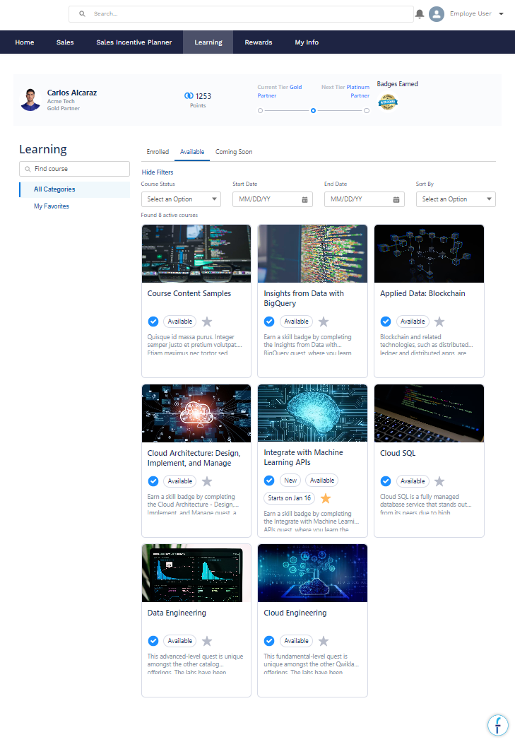
When members are ready to dive into content, they can view a module.
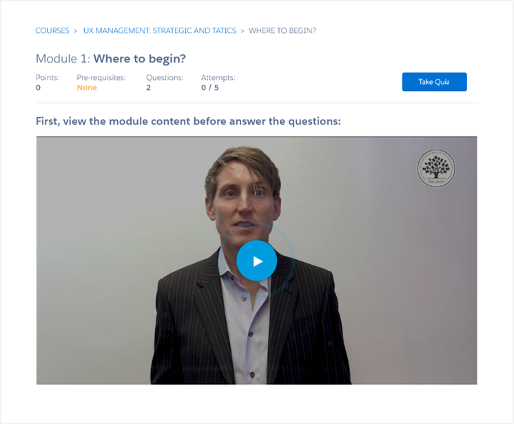
They can then show what they've learned by completing the quiz.
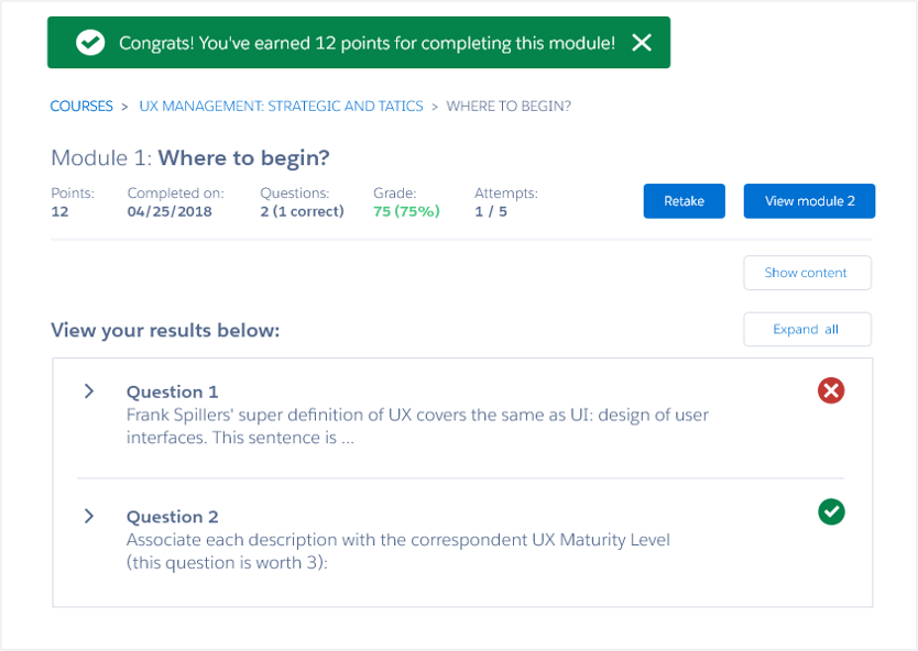
When members submit their quiz, they get immediate feedback on their performance, including if they've earned any rewards on the module. Additionally (if configured), members can submit their feedback about the lesson (modules) taken.
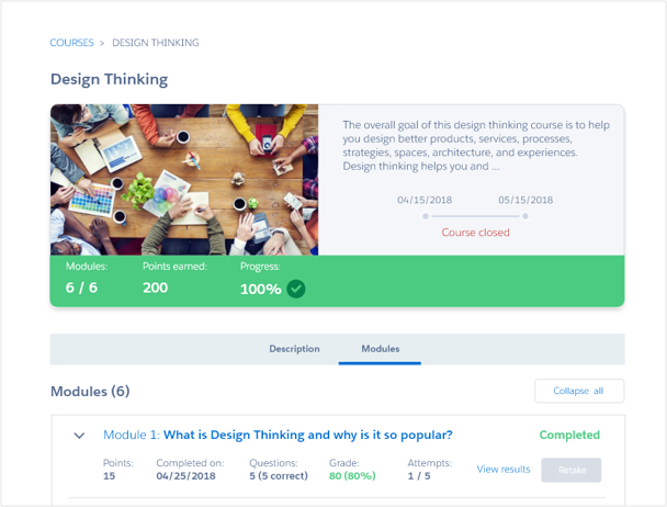
Back on the course detail, members can see their updated progress, including any rewards they earned for completing the entire course.
Provide Permissions
You'll want to provide your learners with the permissions required to use the Learning component. Go ahead and assign the Fielo Learning Community permission set to those users.
Getting Starting with My Learning
Now configuring the member experience is easier than ever, all you have to do is drag and drop the Fielo MX E-learning component on the page.
Make sure to add Fielo MX - Member Selector” component on the pageIn order for any Fielo MX Component to work, you need to add the “Fielo MX - Member Selector” component on that page (or the “Fielo MX - Member Overview” with the Member Selector sub-component set). You can find more information here Member Overview.
You did it!You've set up the My Learning components in your Experience Cloud Site. Next, see how you can configure the components.
Configuring My Learning
At this point, you should have placed the Fielo MX - Member Selector and Fielo MX - E-learning components on your site.
The component is ready to go preconfigured for standard Fielo implementations. However, if your implementation requires it, you can customize your members' learning experience using the properties on each component.
Configuring Properties
Title
This text field will contain the Title Label. “Learning” will be its default value. You replace it with any value that you want or assign a Salesforce custom label value to be shown instead.
Enrolled Tab
Check this box to enable the Enrolled tab. This will show all courses the member is or has enrolled in.
Available Tab
Check this box to enable the Available Tab. This will show all Available courses the members can enroll in.
Scheduled Tab
Check this box to enable the Scheduled Tab. This will show upcoming courses that will become available to members in the future.
Search
Check this box to enable members to search courses based on name (or part of it).
Categories
Check this box to enable members to filter courses by category.
Filters
Check this box to enable members to filter courses based on status, start date, and end date as well as sorting (by name or start/end date).
Mode
This field controls the overall look and feel of the component. We can choose between two settings: Light or Dark.
Direction
This picklist setting will control the overall look and feel orientation.
- Left to Right: this is the default value. When selected, all elements will be rendered from Left (first) to right (second.)
- Right to Left: when this setting is selected all elements will be rendered from the right (first) to left (second).
Course List Style
This field controls the look and feel of the course card (shown in the course list screen). You can select between:
- Banner on Top
- Banner on Background
Course Name
Enter the API name of the field that you want to be displayed in the course name.
Course Description
Enter the API name of the field that you want to be displayed in the course description.
Show Course Status/Eligibility tag
Check this box if you want to show the eligibility tag of each course in the course list.
Show Course Start-End Dates tag
Check this box if you want to show the Start-End dates of each course in the course list.
Allow Course Favorite Bookmark
Check this box if you want to allow members to bookmark their favorite courses. If a member has courses marked as favorites the "My Favorites" category will be shown allowing them to filter.
Show Specific Course(s)
This field enables you to tailor the courses displayed by the component. Simply input the ID of the courses you wish to see, separated by commas.
Pagination
This lets you choose how you want additional courses to be displayed:
- Page adds left and right arrows at the bottom of the component so that members can page through additional courses.
- List adds a Show More button at the bottom of the component so that members can display all courses on a single page as a long list.
Page Size
Will control how many courses will be loaded per page (if greater, Show Next button will be displayed). By default, the number is set to 15.
Custom CSS Classes
This allowed Custom CSS Classes to be applied in the main element, separated by space. Work with your IT department to update this with their customized CSS code.
Custom Static Resource
This allowed a CSS file to be imported from a static resource. Work with your IT department to include the customized CSS information.
Course Status Fields
Enter the API names of the course status fields you wish to display in the course detail header, separated by commas. You may also include the default values of 'Course Status', 'Days Left', and 'Rewards' to display relevant course information in the header.
Module Status Fields
Enter the API names of the module status fields you wish to display in the course detail header, separated by commas. You may also include the default values of 'Status', 'Completed Date', 'Attempts', 'Grade', 'Correct Answers', 'Rewards', and 'Feedback' to display relevant course information in the header.
Closed Courses
This field determines the visibility of closed courses within the component. You can choose to:
- Show in Enrolled and Available: Choose this option to display closed courses on the "Enrolled" or "Available" tabs.
- Group and show all in Closed tab: Choose this option to group and display all closed courses, whether previously enrolled or not, in a new tab labeled 'Closed'.
- Don't show Closed course: Choose this option if you wish to hide closed courses from view in the component.
Updated over 1 year ago